12 Kitchen Color Schemes With Dark Floor to Brighten Your Space
A lot of people feel incredibly intimidated when they walk into a kitchen with dark floors. Whether you have deep charcoal slate tiles, rich walnut wood, or dark espresso laminate, the immediate worry is always the same: Is this going to make my kitchen feel like a dark, cramped cave? It is a completely natural concern. In my experience, the biggest mistake people make is trying to fight the dark floors by painting everything stark, clinical white in a desperate bid to bounce light around. The result usually feels unbalanced, cold, and entirely disjointed.
The secret to a beautiful kitchen isn’t about hiding your dark floors—it is about balancing them. When you pair deep flooring with the right combination of cabinetry, countertops, wall paint, and hardware, you create a space that feels incredibly grounded, cozy, and intentional. You do not need an unlimited budget or a massive architectural layout to make this work. By focusing on how natural light interacts with different materials, choosing colors with warm undertones, and paying attention to small details like cabinet knobs and shelf styling, you can create a kitchen that feels warm and inviting. Let’s look at twelve of the most successful kitchen color schemes that embrace dark floors and turn them into your kitchen‘s best feature.
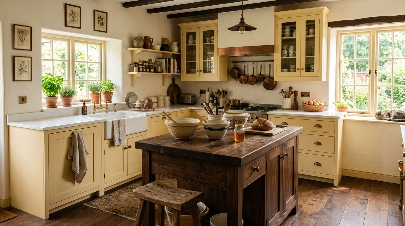
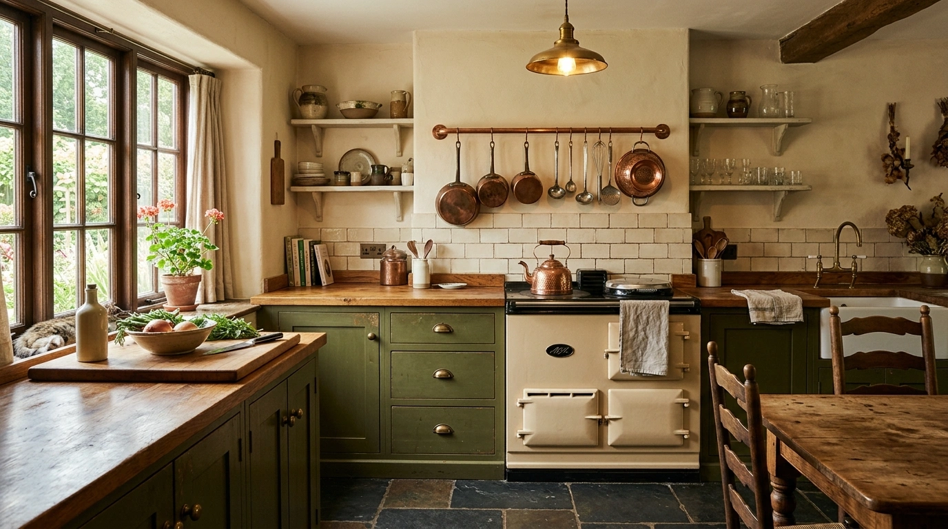
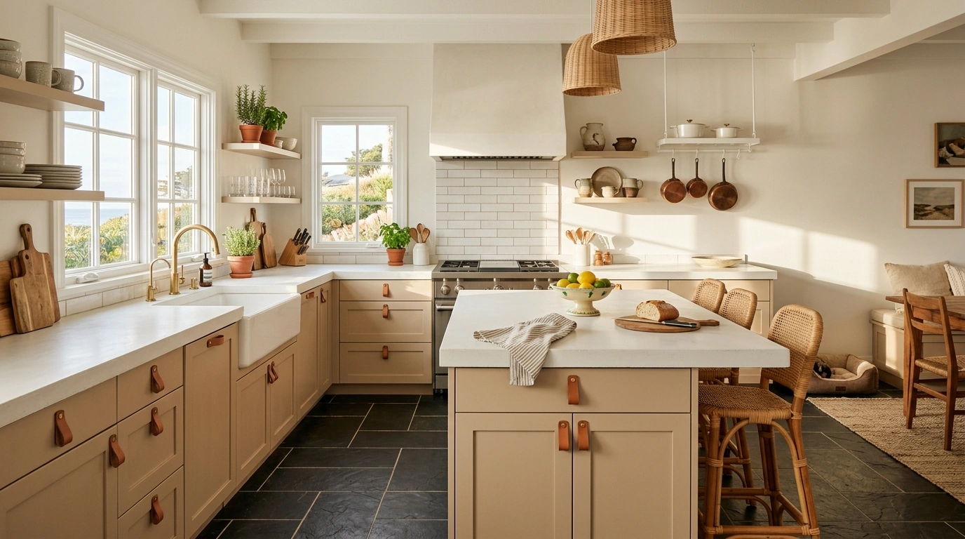
Warm Putty Beige and Antique Brass
What I personally love about this look is how incredibly soft and inviting it feels the second you walk into the room. Instead of the cold, sterile feeling of a stark white, a warm putty beige cabinet shade acts as a gentle buffer against dark hardwood or slate floors. This color combination mimics the quiet beauty of natural stone, reflecting just enough light to keep the kitchen airy while keeping the overall mood deeply grounded. It feels like a quiet morning in a countryside cottage, where the textures of wood and clay are allowed to take center stage.
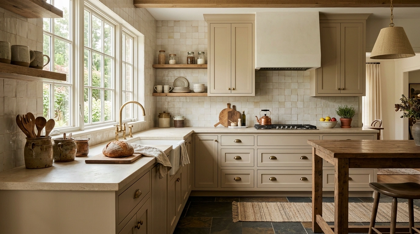
To recreate this layout, look for a beige paint that has subtle gray or stone undertones rather than yellow ones, which can feel dated. I always recommend starting with a matte or low-sheen paint finish for the cabinets to keep the texture looking soft. Pair these beige cabinets with a honed limestone or a creamy quartz countertop that has very soft, warm veining. For the hardware, skip the modern polished chrome and opt for antique brass or aged bronze cup pulls. A common mistake here is using stark white subway tile for the backsplash; instead, use a handmade Zellige-style tile in a soft cream to keep the textured look consistent. If you are on a tight budget, simply painting your existing cabinets putty beige and swapping out old silver handles for warm brass ones will completely change the look.
Earthy Sage Green and Warm Oak Details
This color scheme is perfect if you want to bring a fresh, nature-inspired feel into your home without making the kitchen look overly colorful. Sage green functions almost as a neutral, offering a dusty, muted undertone that softens the weight of dark charcoal tiles or deep oak floors. It creates a serene, restorative space where cooking feels less like a chore and more like a relaxing ritual. The cool tones of the sage contrast beautifully with the deep, moody base of a dark floor, while warm wood accents prevent the green from feeling too cold or clinical.
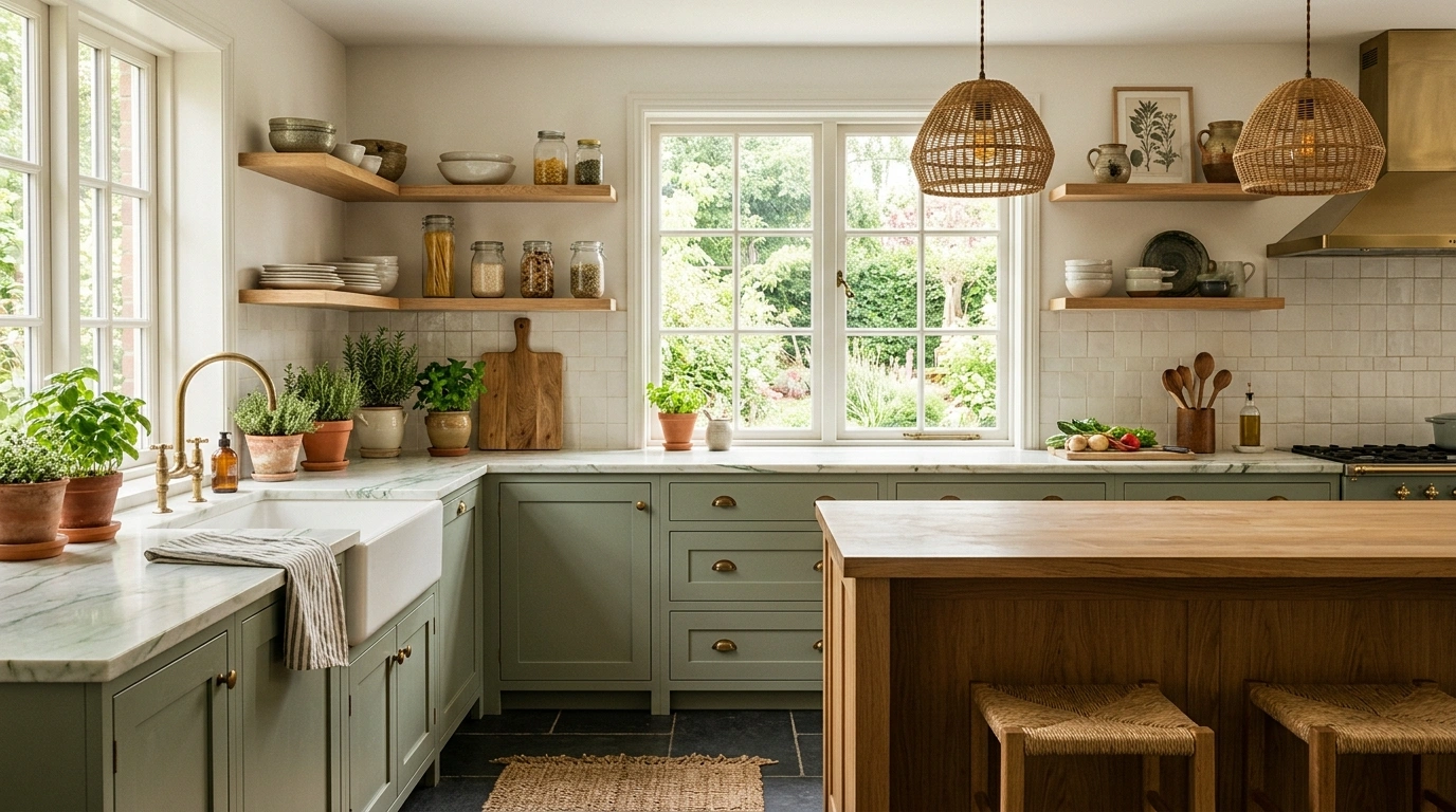
When styling this look, go for a mid-tone sage green on the lower cabinets and keep your upper shelving open and finished in a warm, natural oak. This keeps the visual weight of the room near the floor and makes the ceiling feel much higher. For countertops, a durable white quartzite with subtle green or gray veining ties the cabinets and floors together beautifully. A lot of people overlook this detail, but choosing the right lighting fixtures changes the entire room—opt for woven pendant lights or simple black iron flush mounts to match the organic feel. To save money, you can use high-quality peel-and-stick wood grain laminate to face your open shelves instead of buying solid oak.
Butter Yellow and Dark Walnut Accents
If you want a kitchen that feels like a sunny morning even on the gloomiest winter days, this pairing is an absolute joy. Butter yellow has seen a massive resurgence because it brings a gentle, optimistic energy without the aggressive intensity of a primary yellow. When you pair this soft hue with dark wood floors, the floors act as an anchor, preventing the yellow from feeling childish or overly bright. It feels incredibly cozy, historical, and deeply personal.
To make this scheme work, choose a butter yellow that has a creamy, almost custard-like base rather than a bright lemon undertone. Use this color on your main cabinetry, and then bring in a freestanding dark walnut prep table or a walnut butcher block island to mirror the dark flooring. For the countertops, a simple, clean white solid surface keeps the focus on the beautiful cabinetry. Avoid using high-gloss finishes here, as they can make the yellow look cheap; a soft satin finish is much more sophisticated. For a budget-friendly option, paint your kitchen island butter yellow as an accent piece first before committing to painting all of your cabinets.
Soft Ivory and Honed White Quartzite
This is a beautiful option for anyone who loves the simplicity of a light kitchen but wants to avoid the harshness of a modern white-on-black design. Soft ivory cabinets have a rich, warm undertone that plays beautifully with the shadows created by dark timber or slate floors. It looks put together without trying too hard, offering a clean, open, and spacious feeling while maintaining a sense of homey warmth.
To execute this properly, the key is layering different shades of cream and off-white so the kitchen doesn’t look flat. Pair your ivory cabinets with a honed white quartzite countertop that features warm gold or gray movement. For the backsplash, choose a textured, off-white ceramic tile that catches the light differently throughout the day. I always recommend using warm, unlacquered brass hardware with this scheme because it tarnishes naturally over time, adding a touch of lived-in character. A major mistake to avoid is using cool-toned LED lightbulbs, which will make your gorgeous ivory cabinets look dirty; always choose warm white bulbs (around 2700K) to keep the space looking cozy.
Smoky Blue-Gray and Polished Nickel
There is something incredibly soothing and handsome about a kitchen that pairs smoky blue-gray cabinetry with dark, moody flooring. This shade of blue is much softer than a stark navy and has heavy gray undertones, allowing it to feel like a neutral. It creates a calm, sophisticated mood that works incredibly well in kitchens with plenty of natural light, where the blue tones can shift and change from morning to night.
When styling this layout, pair the smoky blue cabinets with bright, polished nickel hardware. The silver tones of the nickel reflect light beautifully against the darker paint and flooring, adding a touch of sparkle. For the countertops, a classic white marble or a marble-look quartz with bold blue-gray veining will create a gorgeous bridge between the floor and the cabinets. If you are worried about the space feeling too cool, bring in warmth through styling elements like large wooden cutting boards leaned against the backsplash, or a runner rug featuring warm terracotta tones. For a budget alternative, use a high-quality mineral paint on your cabinets, which gives a beautiful, chalky matte finish without the need for expensive spraying equipment.
Muted Terracotta, Off-White, and Black Iron
If you are drawn to Mediterranean or rustic aesthetics, this rich, earthy combination is incredibly grounding. Terracotta brings an instant sense of warmth, sunshine, and clay-like texture to a room, which beautifully balances the coolness of dark concrete or dark slate floors. This works especially well if you want to make your kitchen feel more put together without trying too hard, giving off a relaxed, traveled, and highly artistic vibe.
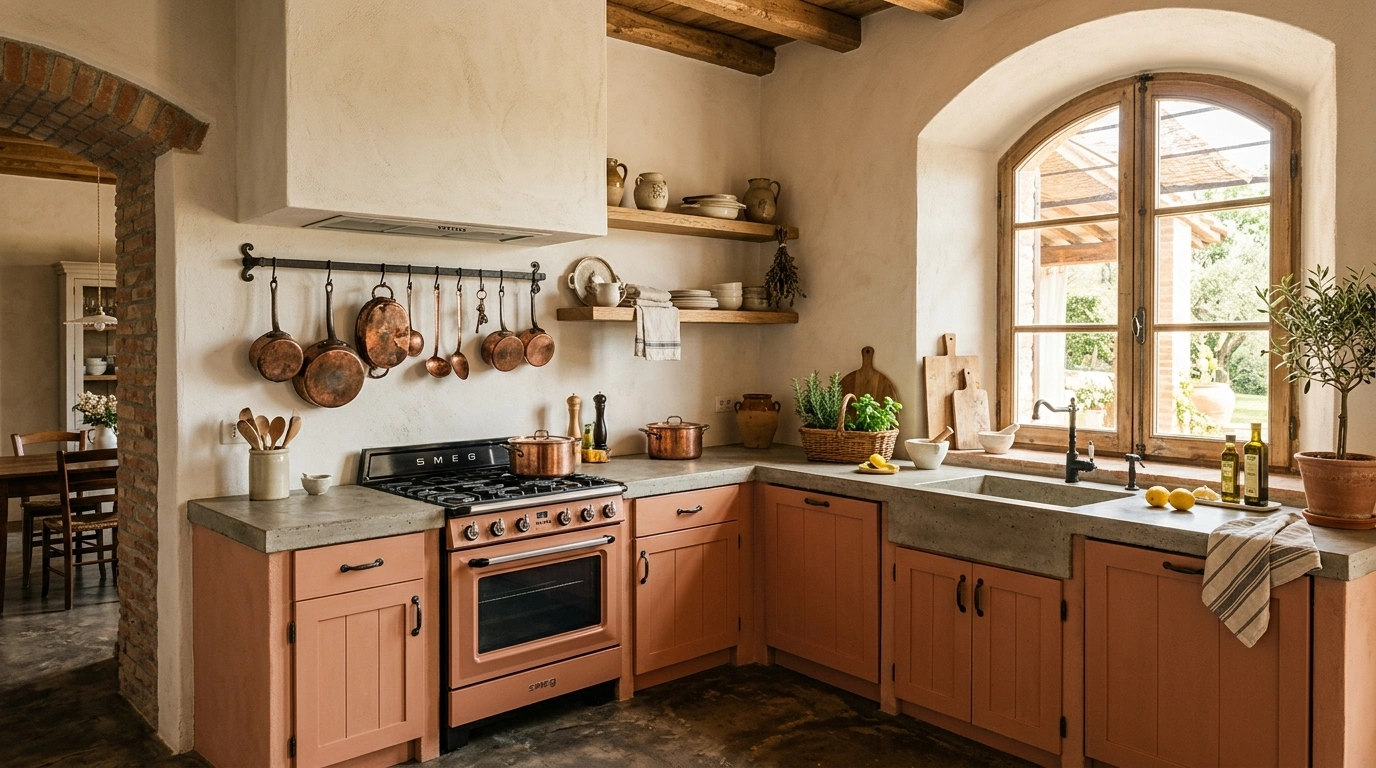
For this look, I recommend using a soft, chalky terracotta paint on just the kitchen island or the lower cabinets, while keeping the upper walls a warm, plaster-like off-white. This prevents the rich reddish-orange tones from overpowering the space. Pair this with dark black iron hardware and matching iron light fixtures to tie in the dark floors. For countertops, a simple concrete or soapstone surface adds to the rustic, tactile appeal of the room. A common mistake here is using glossy, modern tiles for the backsplash; instead, stick to matte finishes, tumbled stone, or even brick veneer. You can easily achieve this look on a budget by displaying vintage copper pots, terracotta planters, and wooden bowls on open shelves.
Olive Green, Cream, and Copper Accents
Olive green is a spectacular choice for dark floors because it carries warm, golden undertones that naturally highlight the grain in dark wood flooring. It feels deeply grounded, historic, and incredibly cozy. Unlike brighter greens, olive has a sophisticated restraint that makes a kitchen feel like a quiet library or a cozy study, making it a wonderful place to gather and linger over long meals.
To recreate this color scheme, paint your cabinetry a deep, muted olive. Pair it with warm cream walls and a matching cream tiled backsplash to keep the upper half of the room bright and airy. What I love about this look is how it comes to life when paired with warm copper accents—think copper pot rails, copper pendant lights, or even a vintage copper kettle on the stove. For the countertops, a warm oak butcher block or a creamy limestone looks incredibly harmonious. Avoid using cool-gray countertops with olive green, as the undertones will clash and look muddy. A great budget-friendly hack is to install a simple copper-colored pipe as a hanging pot rail above your stove to get that warm metal accent without a full remodel.
Chalky Plaster Pink and Aged Oak
While pink might sound intimidating for a kitchen, a dusty, chalky plaster pink acts as an incredible neutral that reflects light in a soft, magical way. It is far from sugary or childish; instead, it has warm clay and peach undertones that soften the starkness of dark espresso floors. It creates a space that feels bright, warm, and highly artistic, making it a favorite among those who love modern, design-forward spaces.
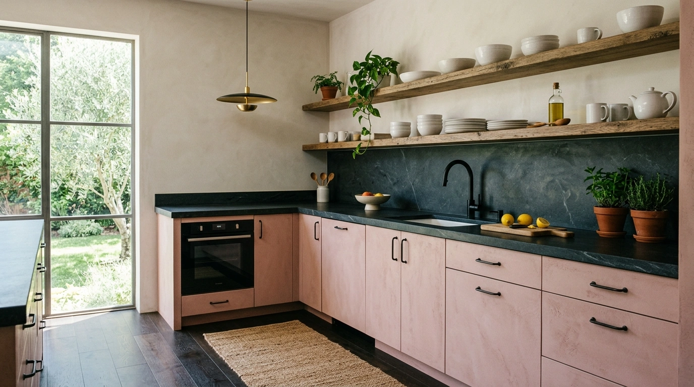
When styling this look, use a very matte plaster-finish pink paint on the walls or the cabinetry. Pair it with open shelving made of aged oak to bring in a rustic, natural element that grounds the pink tones. For countertops, a dark charcoal soapstone or a black slate surface provides a beautiful, high-contrast frame for the soft walls. Choose simple, minimalist black hardware to keep the look modern and clean. A common mistake is adding too many colorful accessories; with plaster pink, you want to keep your decor simple, focusing on white ceramics, clear glassware, and green foliage. If you aren’t ready to commit to pink cabinets, try painting just the walls of an alcove or your pantry in this shade to test how it looks with your dark floors.
Warm Greige, Travertine, and Matte Black Hardware
If you love a clean, minimalist look but hate the cold feeling of modern white kitchens, warm greige is your perfect solution. Greige sits beautifully between gray and beige, offering the modern simplicity of gray with the inviting warmth of beige. Against a dark floor, greige cabinets create a subtle, soft contrast that feels incredibly calm, balanced, and sophisticated.
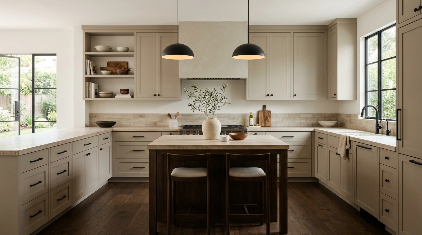
To get this look, select a greige paint that leans slightly warmer to complement the deep tones of your flooring. Pair these cabinets with travertine countertops or a travertine-look porcelain tile backsplash to bring in beautiful, pitted stone textures. Use matte black hardware and minimalist black faucet fixtures to create clean, sharp lines that anchor the soft cabinetry colors. I always recommend keeping the countertops relatively clear of clutter in this scheme, using only a few high-quality items like a large travertine bowl or a single olive branch in a ceramic vase to maintain the clean feel. For an affordable update, use a high-quality stone-look contact paper on your countertops to mimic the beautiful texture of travertine.
Moody Charcoal Gray and Bright Calacatta Marble
For those who prefer a dramatic, high-contrast look, pairing moody charcoal gray cabinets with a dark floor creates an incredibly cozy, cocoon-like atmosphere. It is a bold choice, but when balanced with bright, dramatic marble surfaces, it looks incredibly intentional and luxurious. This works especially well in larger kitchens with high ceilings and plenty of natural window light.
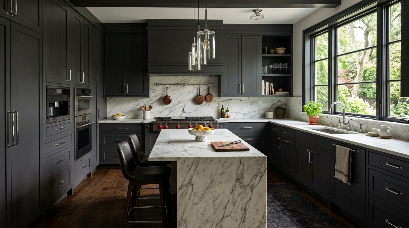
To execute this without making the kitchen feel depressing, paint your cabinetry a deep, warm charcoal gray (almost black, but with softer undertones). Pair this dark cabinetry with a bright white Calacatta marble countertop and matching full-slab marble backsplash. The bold, dramatic gray veining in the white marble will tie the dark cabinets and floors to the bright surfaces, creating a cohesive, high-contrast design. Use polished chrome or polished nickel hardware to act as jewelry for the dark cabinets, reflecting light and adding a clean, modern touch. A common mistake is using dark countertops with dark cabinets and dark floors; this will indeed make the space feel like a dark tunnel. Always keep your horizontal work surfaces bright and reflective.
Soft Sand, Off-White, and Leather Tab Pulls
This color scheme is all about touch, texture, and relaxed coastal vibes. Soft sand cabinetry mimics the warmth of a sun-bleached beach, offering a very light, warm neutral that contrasts gently with dark wood or tiled floors. It feels incredibly breezy, light, and comfortable—perfect for a busy family kitchen where comfort is just as important as style.
To style this look, paint your main cabinetry a soft, sandy tan. Pair it with a simple, clean off-white wall color and a light-colored countertop like white concrete or a solid cream quartz. To add a unique, tactile detail that changes the entire look, swap out standard metal hardware for cognac-colored leather tab pulls. The warm leather tones tie into the sandy cabinets and contrast beautifully with dark floors. Avoid using busy pattern tiles for the backsplash; a simple vertical beadboard painted in the same off-white as the walls keeps the look clean and relaxed. This is an incredibly budget-friendly scheme to recreate, as leather cabinet pulls can easily be made at home using scrap leather and simple brass screws.
Deep Merlot Red and Warm Oak Timber
If you want to create a space that feels incredibly rich, dramatic, and historic, pairing deep merlot red with dark floors is an absolute showstopper. Merlot and deep aubergine tones are proving incredibly popular because they bring a moody, artistic energy to the kitchen. The warmth of the red tones softens the depth of dark floors, creating a space that feels balanced, grounded, and deeply luxurious.
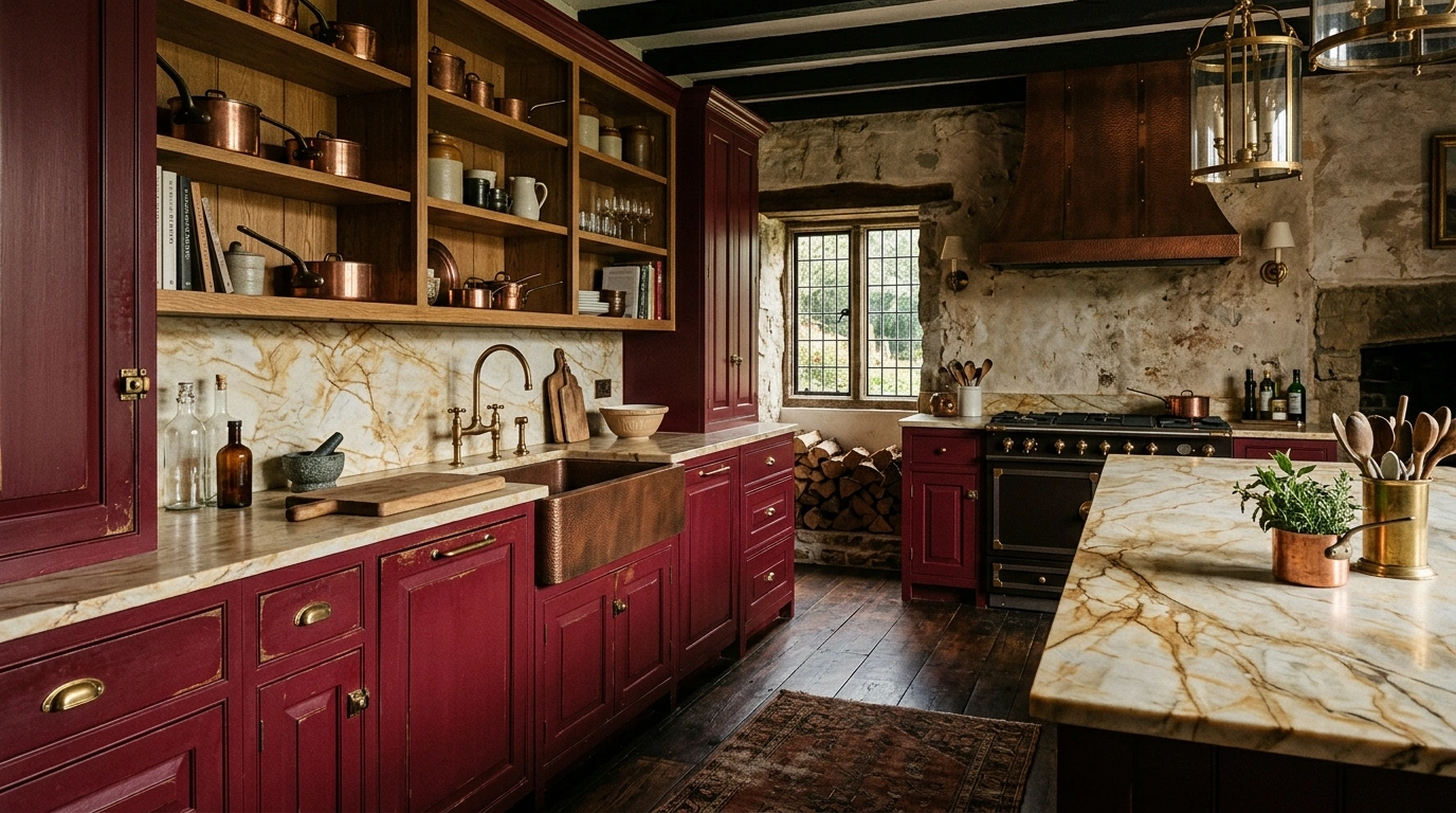
When styling this bold combination, use the deep merlot red on your lower cabinets or your kitchen island. To prevent the room from feeling too heavy, use warm, mid-tone oak for your upper cabinets or wall shelving. The natural wood grain helps soften the depth of the red paint. For the countertops, a warm, creamy quartzite or a light-colored soapstone looks incredibly grounded. For hardware, choose unlacquered brass or antique copper to match the warm, historic feeling of the red. A common mistake is using bright, primary reds, which can look aggressive; always choose a red with heavy brown, purple, or black undertones to keep it sophisticated. If you are hesitant about this look, start by painting a small hutch or a bar cabinet in merlot to see how much warmth it brings to your space.
Conclusion
At the end of the day, creating a beautiful kitchen is about confidence over perfection. You do not need to spend tens of thousands of dollars on a complete remodel to make your kitchen a space you love spending time in. Often, trying just one or two small ideas—like painting your kitchen island a warm putty beige, swapping out your cabinet knobs for antique brass, or displaying some warm wood cutting boards—is all it takes to make your space feel completely different.
Your dark floors are not a design obstacle; they are a beautiful, grounded canvas waiting for you to bring in warmth, color, and personality. By choosing one of these thoughtful kitchen color schemes with dark floor, you can create a room that feels both practical for everyday life and incredibly beautiful to look at. Which of these color schemes would you actually want to cook in first? I’d genuinely love to know!
Q: How do I keep a kitchen with dark floors from looking too dark?
I always recommend starting with your horizontal surfaces. Keep your countertops and backsplashes light and reflective—such as light quartz, honed marble, or white handmade tiles—to bounce natural light around the room and balance the dark flooring.
Q: Do kitchen cabinets need to match a dark floor?
No, and in fact, they shouldn’t! Matching your cabinets exactly to your dark floors can make your kitchen look heavy and dark. Instead, aim for contrast by choosing warm neutrals, soft greens, blues, or light wood tones to create depth.
Q: What cabinet colors make a kitchen with dark floors look more expensive?
Soft, warm tones like putty beige, warm ivory, greige, and muted sage green naturally look more expensive. These colors allow the beauty of natural materials, wood grain, and metal hardware to stand out without looking stark or clinical.
Q: What color hardware looks best with dark floors?
Warm hardware finishes like antique brass, unlacquered brass, copper, and matte black look beautiful with dark floors. They draw out the warm undertones in the flooring and add a cozy, high-quality feel to your cabinetry.
Q: How do I style open shelving to complement a dark floor?
Use natural materials to bridge the gap between light walls and dark floors. Display warm wood cutting boards, ceramic pottery in earthy tones, clear glassware, and small plants to bring organic texture and warmth into the space.