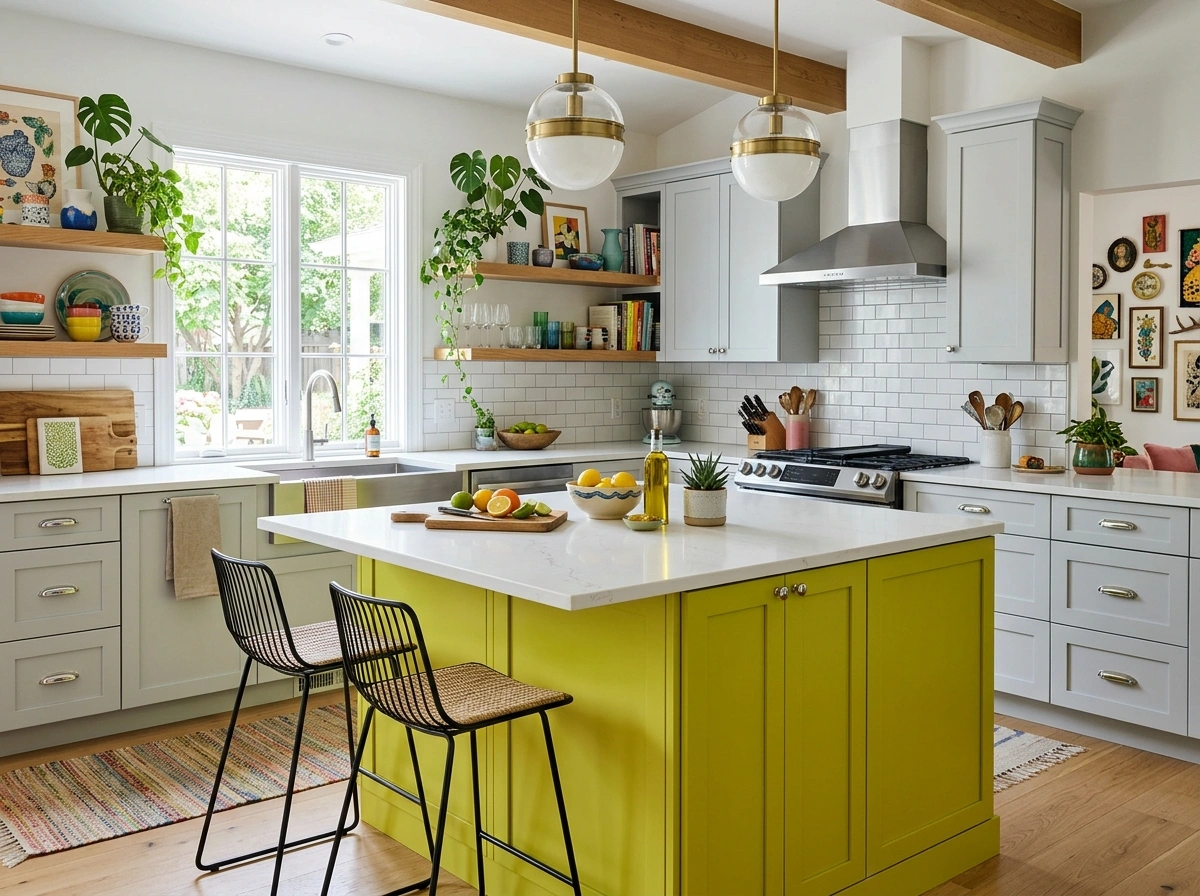
If you have spent any time looking at home design accounts lately, you have probably noticed that the plain, all-white kitchen is slowly taking a back seat. People want their homes to feel cozy, inviting, and full of life, which is why green kitchen color schemes have absolutely exploded in popularity. But trying to choose the right shade of green can feel incredibly overwhelming when you are staring at hundreds of tiny paint swatches at the hardware store. It is easy to worry that a dark green will make your kitchen look like a dark cave, or that a lighter shade might end up looking like a doctor’s office waiting room.
The secret to making green work in a kitchen isn’t just about picking a single paint color; it is about how you balance that color with your countertops, your cabinet hardware, and your floors. A green kitchen should feel grounding and comfortable, serving as a space where your family actually wants to hang out and drink morning coffee. In this guide, we are going to walk through 16 real-world green kitchen color combinations that you can easily recreate in your own home. Whether you are doing a complete remodel or just want to give your existing cabinets a quick weekend DIY paint refresh, you will find a scheme here that matches your personal style and budget.
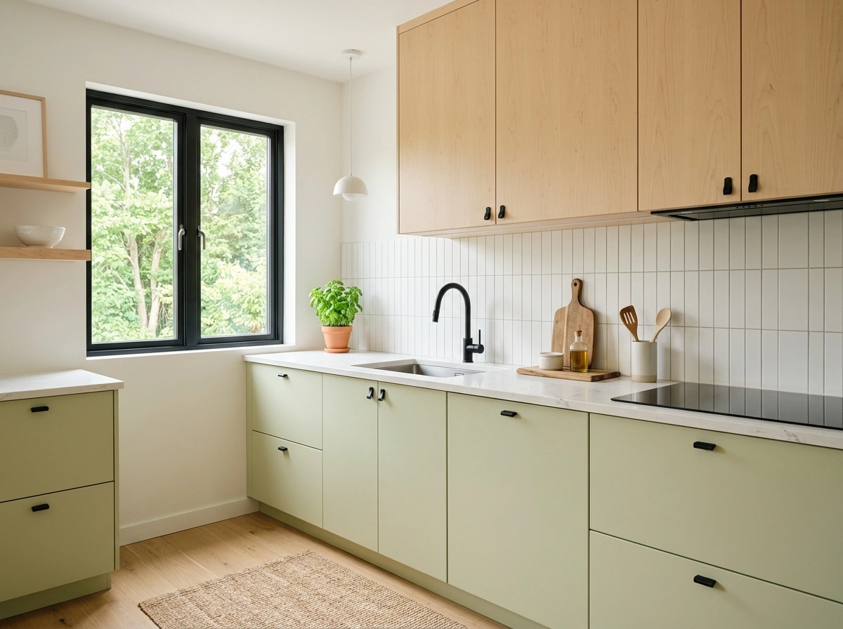
Sage Green & Warm Oak
What I personally love about this look is how quiet and calming it feels the second you walk into the room. Sage green has soft gray undertones that mimic the natural leaves in a garden, making the entire kitchen feel incredibly peaceful and connected to the outdoors. When you pair this muted green with the golden, honey-like tones of natural warm oak, the room instantly softens up and feels cozy. It feels like a sunny Saturday morning, even when it is raining outside, because the wood brings so much organic warmth to the cool green paint.
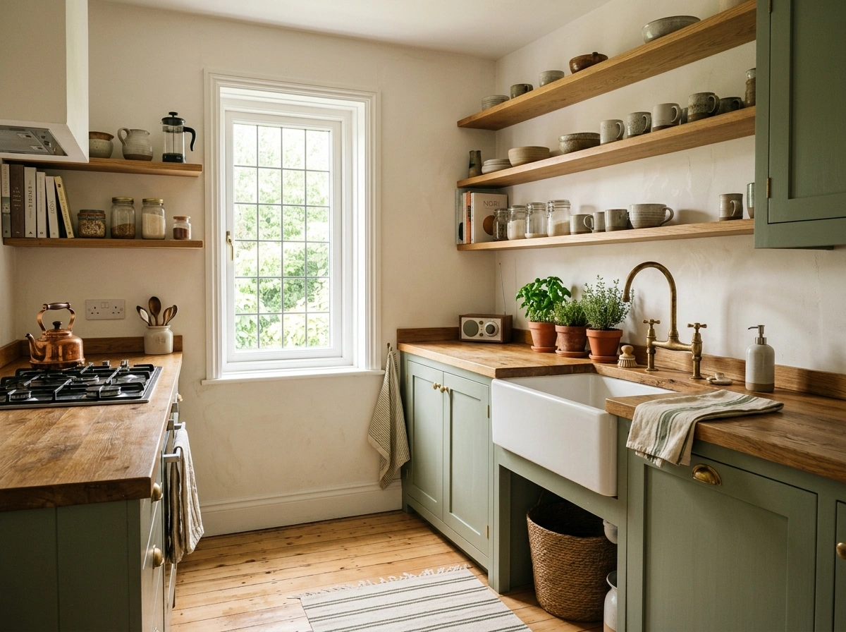
I always recommend starting with a soft sage paint like Farrow & Ball’s Mistletoe or Sherwin-Williams’ Clary Sage for your cabinets. To keep this looking grounded and deliberate, use open oak shelving or a solid oak kitchen island to break up the green cabinetry. For hardware, skip the bright modern chrome and choose antique brass or brushed copper instead, which adds a subtle vintage touch. If you are on a tight budget, you can easily get this look by painting your cabinets sage and adding affordable oak butcher block countertops from your local home improvement store.
Deep Olive & Aged Brass
There is something incredibly cozy and rich about a deep olive green kitchen when it is paired with the warm, metallic glow of aged brass. Olive green has heavy yellow and brown undertones, which means it doesn’t feel cold or clinical like some blue-greens can. In the evening under warm lighting, this color scheme feels like a moody, high-end restaurant where you want to sit at the island and chat for hours. It works especially well in historic homes or spaces with lots of character, giving off an organic, historic vibe that feels intentional.
The biggest mistake people make with dark olive is using a paint that is too bright or grassy, which can make the room look dated. Look for muddy, swampy olives like Benjamin Moore’s Olive Bronze or Spiced Apple Cider to get that deep, sophisticated tone. Pair these cabinets with unlacquered brass hardware that will naturally tarnish over time, developing a beautiful, lived-in patina. To balance the dark cabinets, use a warm off-white or cream paint on the walls and keep your countertops light, using a durable quartz with subtle warm veining.
Forest Green & Carrara Marble
If you love high-contrast looks but want something softer than basic black and white, this combination is an absolute showstopper. Forest green is incredibly deep and dramatic, acting almost like a neutral while still bringing plenty of rich color to the room. When you pair this dark, moody paint with the bright, cool gray-and-white veins of classic Carrara marble, the contrast is absolutely beautiful. The marble reflects the light and keeps the dark green from swallowing up the room, creating a very balanced, classic look.
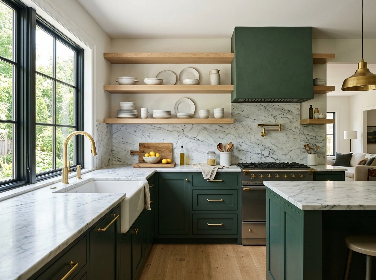
To recreate this look without spending a fortune, you don’t actually need to buy expensive solid marble slabs for your countertops. A high-quality quartz that mimics Carrara marble works just as well and is much easier to clean and maintain if you have kids or cook often. Paint your cabinets in a rich, dark green like Sherwin-Williams’ Pewter Green or Benjamin Moore’s Salamander. Keep the upper cabinets white or swap them for open white oak shelves to keep the room feeling airy and bright at eye level.
Mint Green & Bright White
This is the ultimate color scheme for anyone who wants a kitchen that feels bright, cheerful, and incredibly clean without feeling sterile. Mint green is playful and fresh, evoking a vintage, retro kitchen vibe that instantly puts you in a good mood when you walk in. When paired with bright white walls and clean white subway tile, the mint cabinets pop beautifully, making even the smallest, darkest kitchens feel much larger and sunnier than they actually are. It is a fantastic choice for cottage-style homes, small apartments, or sunny coastal spaces.
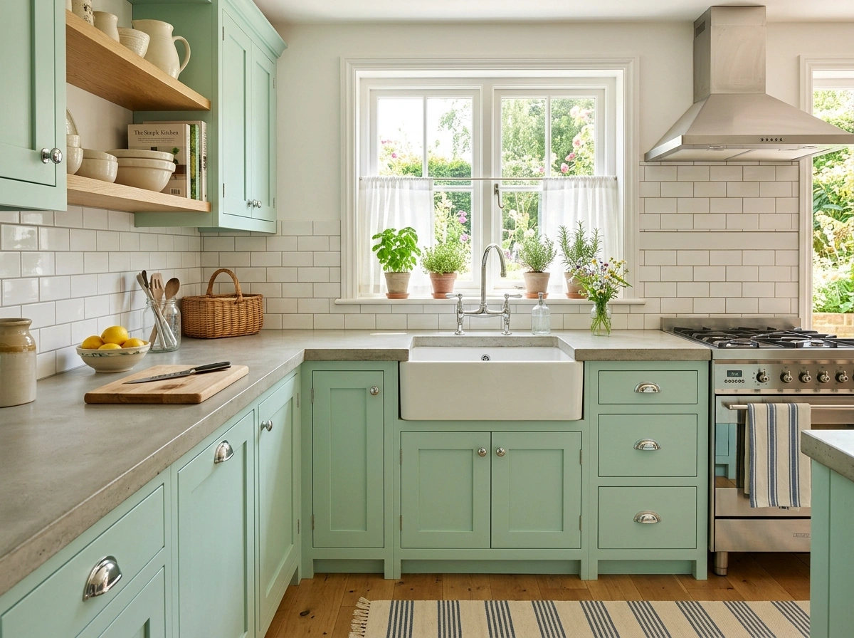
The key to keeping mint green from looking like a nursery is to choose a shade with a slight gray or blue undertone, such as Benjamin Moore’s Soft Mint. Pair the cabinets with polished nickel or chrome hardware to match the bright, clean energy of the paint. For countertops, a simple white solid-surface material or a light concrete countertop keeps the focus entirely on the beautiful cabinet color. To avoid a space that feels too cold, bring in a few natural wood cutting boards and small potted herbs on the windowsill to ground the look.
Eucalyptus Green & Warm Terracotta
If you want a kitchen that feels earthy, textured, and slightly rustic, this Mediterranean-inspired combination is absolutely perfect. Eucalyptus green is a soft, dusty shade with heavy blue-gray undertones that looks incredibly soft under natural sunlight. When you pair this cool, leafy green with the warm, baked-clay tones of terracotta tile, you get an incredible balance of warm and cool tones. It makes the kitchen feel like a rustic villa in Italy, where cooking is slow and every meal is shared with a big group of friends.
In my experience, the easiest way to pull this off is to use eucalyptus green for your main cabinets and use real terracotta tiles for either your floor or your backsplash. Look for a cabinet paint like Sherwin-Williams’ Eucalyptus or Behr’s In the Moment. Keep your hardware simple and understated—matte black iron handles work beautifully here because they ground the rustic textures without competing with them. For the countertops, a simple white oak butcher block or a matte gray soapstone keeps the overall style feeling earthy and organic.
Pistachio & Pale Maple Wood
This combination is a dream for lovers of modern, minimalist design who want to bring a little bit of color and softness into their home. Pistachio is a pale, milky green that has a lot of yellow in it, making it feel warm, light, and incredibly modern. When paired with the clean, pale grain of maple wood, the kitchen feels very airy, clean, and organized. It is a highly aesthetic look that feels incredibly fresh, working beautifully in open-concept homes where the kitchen is visible from the living room.
To make this look work, paint your lower cabinets in a pale pistachio shade like Benjamin Moore’s Pistachio and use pale maple wood for your upper cabinets or your kitchen island. Keep your hardware completely minimalist—flat black pull tabs or simple wooden knobs keep the lines of the cabinets looking clean and unbroken. For your backsplash, simple vertical stacked white tiles with white grout will emphasize the clean, modern lines of the kitchen. This setup keeps the room looking light and bright without relying on boring all-white cabinetry.
Emerald Green & Charcoal Black
For those who are not afraid of bold design choices, this moody, industrial-leaning color scheme is incredibly striking. Emerald green is vibrant, rich, and full of energy, making it a fantastic accent color that commands attention the moment you enter the room. Pairing it with deep charcoal black accents—like black light fixtures, black hardware, or a black kitchen island—tones down the brightness of the emerald. This contrast makes the kitchen feel grounded, modern, and incredibly artistic.
I always recommend starting with a rich, jewel-toned emerald paint like Sherwin-Williams’ Hunter Green or Farrow & Ball’s Emerald Green. To keep the space from feeling too dark or heavy, limit the charcoal black to your metal hardware, your faucet, and your light fixtures. Pair these with a light gray concrete countertop or a white quartz with heavy dark gray veins to bridge the gap between the green and black. If your kitchen doesn’t get a lot of natural light, make sure to add plenty of warm under-cabinet LED strip lights to keep the workspace functional.
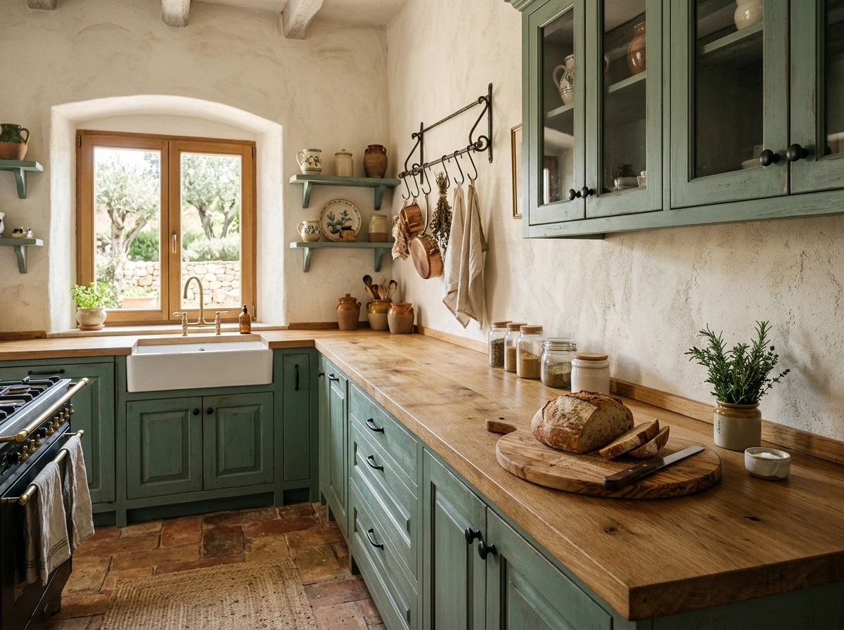
Moss Green & Unfinished Pine
If your dream is to live in a cozy cabin in the woods, this rustic, organic color scheme will bring that exact feeling into your home. Moss green is a warm, forest-floor shade that has strong yellow and brown undertones, making it look incredibly natural and rich. When you pair this cozy paint color with the knotty, textured look of unfinished or lightly sealed pine wood, the kitchen feels instantly lived-in, warm, and comforting. It is a look that embraces imperfections, scratches, and the natural beauty of simple materials.
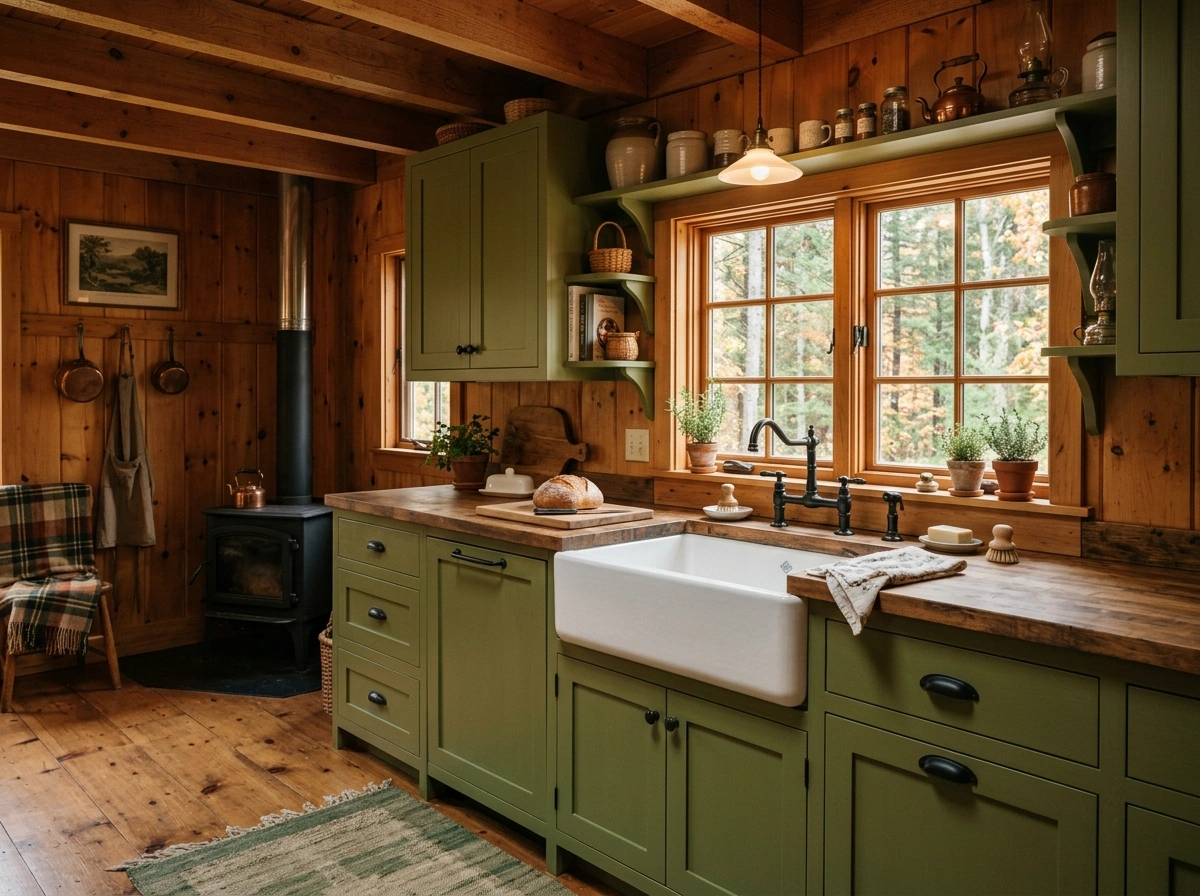
To recreate this style, use a mossy green paint like Benjamin Moore’s Mohegan Sage on your perimeter cabinets. Instead of standard drywall, consider using pine tongue-and-groove paneling on your walls or ceiling to bring in that cozy cabin texture. Choose simple black cast iron hardware that looks hand-forged, adding to the rustic, historic feel of the kitchen. A farmhouse sink made of fireclay or copper completes this look beautifully, creating a central focal point that feels incredibly nostalgic and charming.
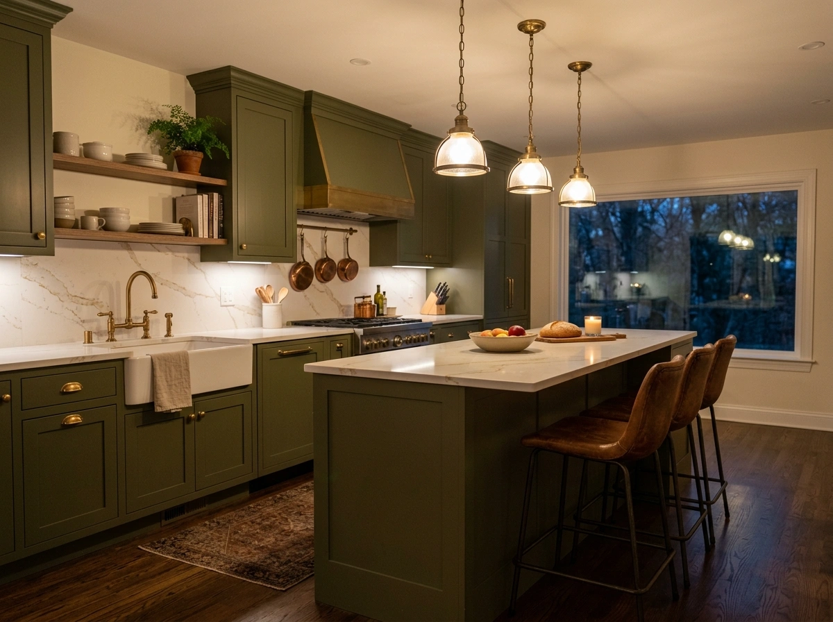
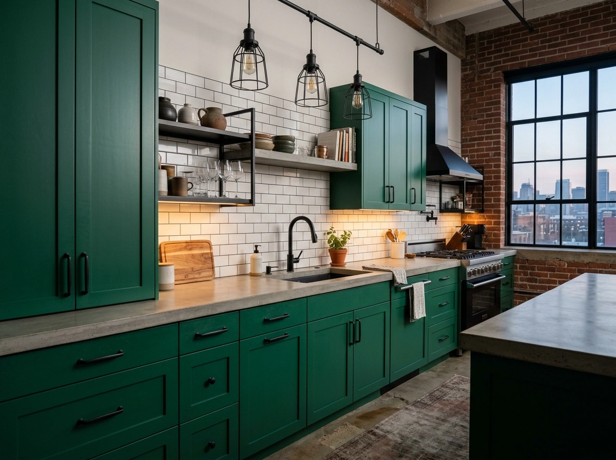
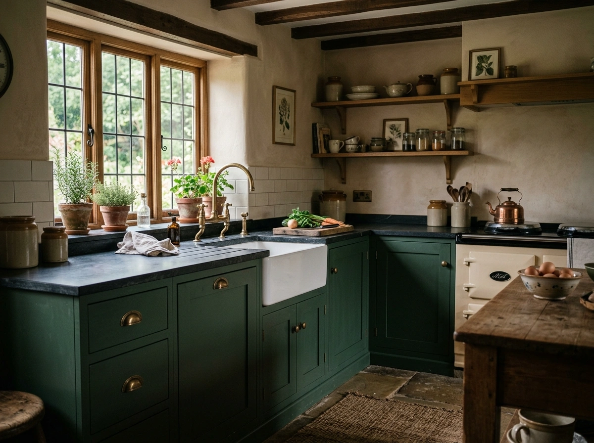
Hunter Green & Shiny Copper
There is a traditional, historic richness to hunter green that makes it feel incredibly permanent and well-established. When you pair this deep, regal green with the bright, reflective warmth of copper pots and copper cabinet hardware, the room feels beautifully balanced. Copper has a bright orange-red undertone that sits directly opposite green on the color wheel, which means these two colors naturally make each other pop without looking like Christmas decorations. It feels like an old-world English kitchen where hearty stews are always simmering on the stove.
To make this scheme work, paint all of your cabinetry in a true, dark hunter green like Farrow & Ball’s Studio Green or Benjamin Moore’s Hunter Green. Hang a copper pot rack above your kitchen island or stove to display your cookware, which doubles as beautiful, functional wall art. Use solid copper or copper-plated cups and pulls on your cabinet drawers to pull the metallic theme together. For countertops, a dark soapstone or a black honed granite keeps the overall look feeling rich, historic, and incredibly high-end.
Seafoam Green & Weathered Gray
If you want your kitchen to feel like a relaxed, breezy beach cottage, seafoam green paired with weathered gray is an incredible choice. Seafoam is a very soft, pale green with heavy blue and gray undertones, making it look like the ocean on a foggy morning. When you pair it with the soft, textured gray of weathered wood or gray stone, the kitchen feels quiet, rustic, and incredibly relaxing. It is a fantastic scheme for high-traffic family kitchens because the soft colors are very forgiving with dirt, fingerprints, and daily wear and tear.
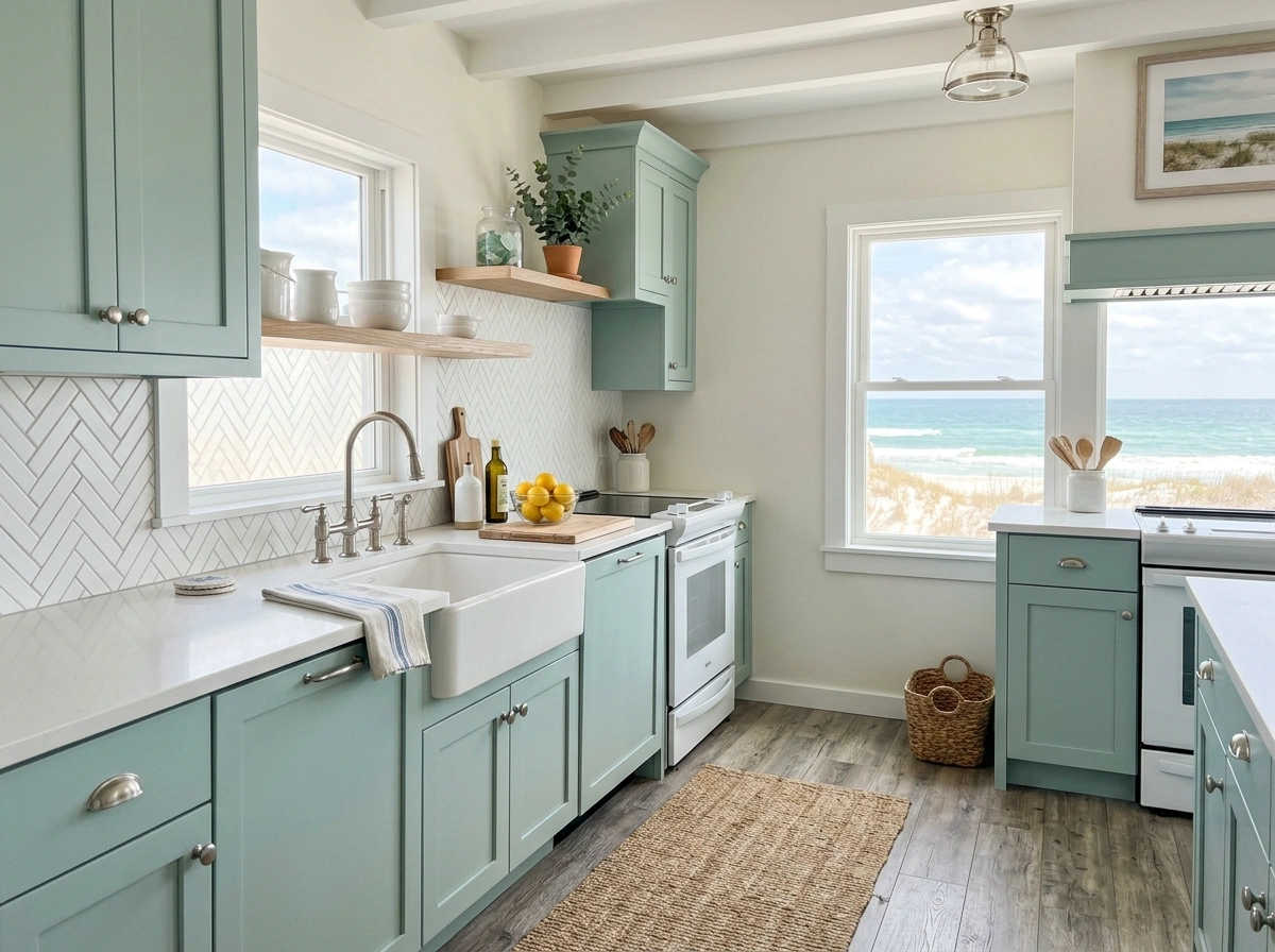
Look for a soft, sea-inspired paint color like Sherwin-Williams’ Sea Salt or Benjamin Moore’s Palladian Blue (which reads as a beautiful soft seafoam on walls). Pair these cabinets with hardware made of brushed nickel or pewter, which matches the cool, soft tones of the paint. For your floors or kitchen island, use a wood stain that has gray undertones to mimic the look of driftwood. A simple white herringbone tile backsplash adds just enough pattern to keep the kitchen looking interesting and custom-designed without overwhelming the soft colors.
Jade Green & Rich Walnut
This combination is a dream for anyone who loves mid-century modern design or rich, artistic interiors. Jade green has a beautiful, saturated jewel-tone quality that feels incredibly artistic and mid-century. When paired with the deep, swirling chocolate-brown grain of natural walnut wood, the kitchen feels incredibly high-end, structured, and warm. It is a sophisticated combination that looks best when kept simple, letting the beauty of the wood grain and the richness of the green paint do all the heavy lifting.
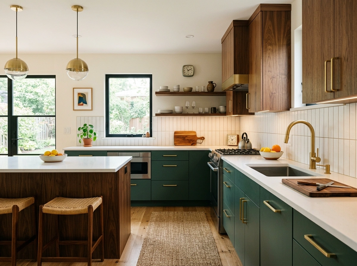
To pull this off, I always recommend using a rich jade paint like Benjamin Moore’s Jade Romanesque on your lower cabinets, while keeping your upper cabinets made of flat-panel walnut wood. The dark, warm walnut balances the cool green and draws the eye upward, making your ceilings feel higher. Use sleek, modern hardware in matte black or satin brass to complement the mid-century modern aesthetic. For countertops, a simple, solid white quartz keeps the focus entirely on the beautiful wood panels and rich cabinet color.
Celadon Green & Warm Cream
If you want a green kitchen but are worried about making a choice you will get tired of in a few years, this is the safest, most beautiful option. Celadon green is an incredibly soft, grayed-out green that is so subtle it almost acts as a neutral. When you pair this soft, whisper-quiet green with warm cream instead of bright, stark white, the kitchen feels incredibly soft, clean, and timeless. It is a look that never goes out of style and works beautifully in traditional, transitional, and farmhouse-style homes alike.
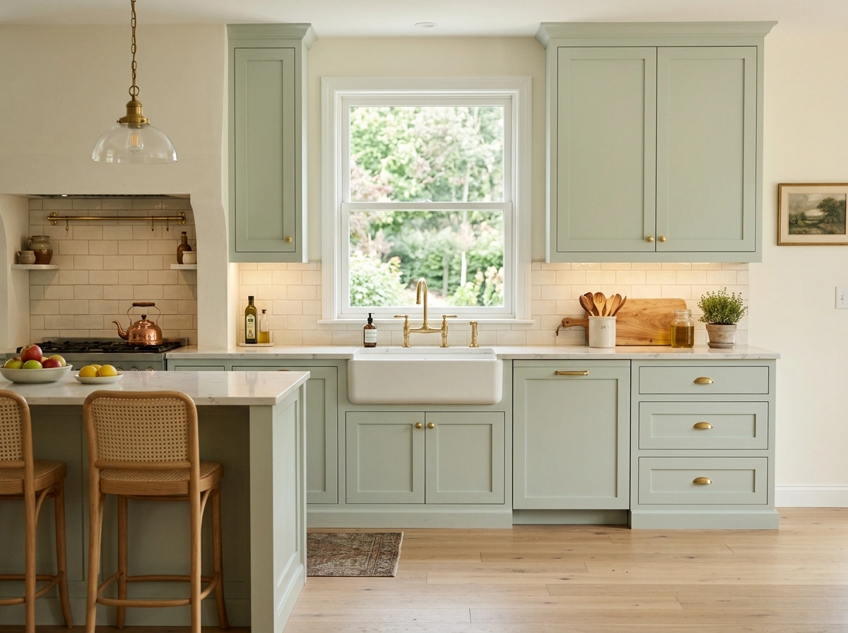
Choose a very pale, dusty celadon paint like Farrow & Ball’s Green Ground or Sherwin-Williams’ Sea Spray. Instead of painting your walls a bright white, choose a warm, buttery cream like Benjamin Moore’s Swiss Coffee to paint your walls, trim, and ceiling. This creates a very soft, low-contrast look that feels incredibly restful to the eyes. Pair these soft colors with polished brass hardware to add a little bit of sparkle and warmth, and use a simple white oak flooring to tie the entire room together.
Army Green & Raw Concrete
For an edgy, modern, or loft-style home, pairing a utilitarian army green with the raw, textured look of concrete is incredibly cool. Army green is a flat, matte green with heavy brown and gray undertones, giving it a very grounded, practical, and industrial feel. When you pair it with the mottled, cool gray of concrete countertops or concrete floors, the kitchen feels very strong, modern, and uncluttered. It is a fantastic choice for anyone who loves minimalist design but wants more character than a simple gray kitchen can offer.
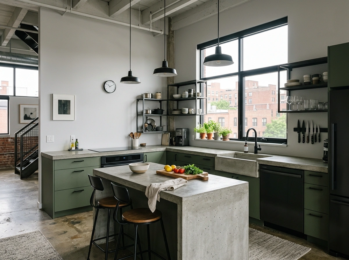
To recreate this look, paint your cabinets a solid, matte army green like Sherwin-Williams’ Rosemary or Benjamin Moore’s Army Green. If you don’t want to pour real concrete countertops (which can be heavy and difficult to maintain), you can use concrete-look quartz countertops from brands like Caesarstone or Silestone. Use simple matte black hardware and minimalist industrial pendant lights with exposed bulbs to match the raw, utilitarian energy of the space. A simple white drywall or plaster backsplash keeps the focus on the beautiful textures of the concrete and paint.
Chartreuse & Pale Gray
If you want a kitchen that is bursting with energy, creativity, and modern style, chartreuse and pale gray is a brilliant, unexpected choice. Chartreuse is a bright, yellow-green that is incredibly vibrant and playful, making it a fantastic color for people who love to express their personality through their home decor. Pairing it with a quiet, calm, pale gray tones down the brightness of the chartreuse, keeping the kitchen from feeling too loud or overwhelming while still retaining its fun, energetic spirit.
Because chartreuse is so bright, a little bit goes a very long way in a kitchen. A lot of people overlook this detail, but I always recommend painting just your kitchen island or a single accent cabinet bank in chartreuse (like Benjamin Moore’s Chartreuse), while keeping the rest of your cabinets a soft, pale gray like Sherwin-Williams’ Repose Gray. Use modern chrome or polished nickel hardware to keep the look feeling clean and contemporary. This allows you to have a fun, artistic kitchen that still feels balanced, clean, and easy to live with every day.
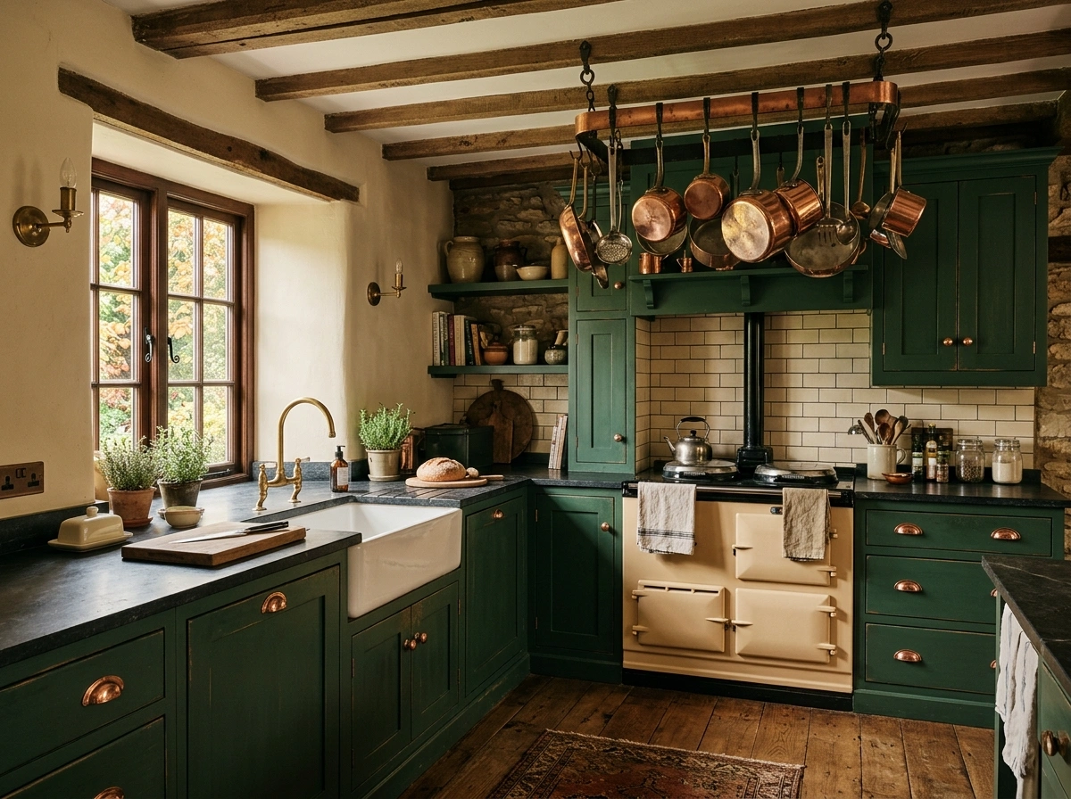
Juniper Green & Soapstone
There is a dark, moody English cottage charm to juniper green that feels incredibly historic, cozy, and personal. Juniper is a deep, cool green with strong blue and slate-gray undertones, mimicking the dark needles of an evergreen tree in the winter. When you pair this deep, cool green with dark, velvety charcoal soapstone countertops, the kitchen looks incredibly solid, historic, and grounding. It feels like a quiet sanctuary where you can escape the rush of the modern world and enjoy the slow process of cooking a homemade meal.
To get this moody, historic look, paint your cabinets in a deep juniper green like Farrow & Ball’s Studio Green or Benjamin Moore’s Narragansett Green. Real soapstone countertops are fantastic because they naturally darken over time and have beautiful, faint white veins running through them. If you are on a budget, you can get a very similar look by using a dark charcoal gray honed granite or slate. Use simple, unlacquered brass hardware and add a vintage-style brass bridge faucet to complete the historic, old-world English cottage aesthetic.
Teal Green & Satin Gold
This combination is bold, vibrant, and incredibly sophisticated, perfect for anyone who wants a kitchen that feels like a glamorous design statement. Teal green sits right between blue and green, offering a deep, rich, and saturated color that feels incredibly plush and luxurious. When you pair this rich, deep color with the bright, glowing metallic warmth of satin gold hardware, the kitchen feels incredibly high-end and custom-designed. It is a fantastic choice for modern homes, urban apartments, or spaces designed for entertaining friends and hosting dinner parties.
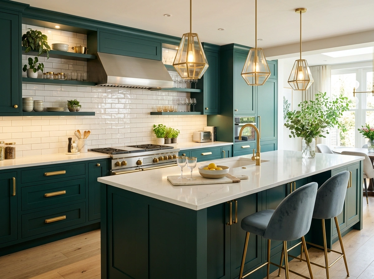
Look for a rich, balanced teal paint like Benjamin Moore’s Teal or Sherwin-Williams’ Cascades. Use sleek, modern satin gold handles and pulls on your cabinets, and choose matching gold light fixtures to create a beautiful, cohesive metallic theme throughout the room. To balance the intense depth of the teal, use clean white quartz countertops and a simple white glossy tile backsplash that will reflect the light and keep the kitchen feeling bright, open, and incredibly luxurious.
Conclusion
At the end of the day, designing your kitchen should be an exciting journey of creating a space that makes you feel happy and comfortable every time you walk in. You do not need to spend tens of thousands of dollars on custom designer cabinets or rare imported stone to create a beautiful, Pinterest-worthy green kitchen. Sometimes, all it takes is a couple of cans of high-quality paint, some fresh cabinet hardware, and a few cozy styling touches like a nice wood cutting board or a warm runner rug to completely change the feel of your entire home.
If you are feeling stuck or nervous about making a final decision, I always recommend starting small. Buy 3 or 4 small paint samples of your favorite green shades and paint them onto large pieces of cardboard, then tape them to your kitchen cabinets for a few days. Watch how the colors change in the bright morning sun, the flat afternoon light, and under your kitchen lights at night before you commit to painting.
Which of these green kitchen color schemes would you actually want to live with first? I’d genuinely love to know in the comments below!
Q: How do I make basic green cabinets look more expensive?
In my experience, the easiest way to make budget-friendly green cabinets look high-end is to swap out standard silver hardware for warm antique brass or matte black pulls. Adding simple wooden accents, like a solid oak cutting board or open wood shelving, also breaks up the paint and makes the kitchen feel custom-designed.
Q: What colors make green kitchens look warmer and cozier?
To keep your green kitchen from feeling cold or clinical, pair your cabinets with warm cream or off-white walls instead of bright, stark white. Using warm wood tones like oak, walnut, or butcher block countertops, along with warm-toned metals like brass, copper, or gold, will instantly make the room feel incredibly inviting.
Q: What is the most popular green paint color for kitchens right now?
Sage green is currently the most popular green paint color because it is soft, subtle, and acts almost like a neutral. Shades like Sherwin-Williams’ Clary Sage or Farrow & Ball’s Mistletoe are incredibly popular because they look beautiful under almost any lighting condition.
Q: How do I choose the right green paint if my kitchen gets very little natural light?
If your kitchen doesn’t get a lot of natural sunlight, avoid very dark greens like forest or hunter green, which can make the room feel like a cave. Instead, choose a lighter, warmer green with yellow undertones, like pistachio or a light sage, and make sure to use warm under-cabinet LED lighting to keep the workspaces bright.
Q: Can I paint my existing kitchen cabinets green myself?
Yes, you can absolutely paint your existing cabinets yourself as a budget-friendly weekend DIY project. The biggest mistake people make is skipping the preparation work; make sure to thoroughly clean, sand, and prime your cabinets before applying your green paint to ensure the color goes on smoothly and lasts for years.