12 Cozy Kitchen Color Schemes with White Cabinets
It is so easy to fall in love with the clean, bright look of white cabinets, but actually living with them can sometimes feel a bit different. In my experience, the biggest mistake people make is keeping everything else in the room too plain, which quickly turns a beautiful home into something that looks clinical, cold, or even hospital-like. You want your home to feel inviting, not sterile. The secret to making white cabinetry work is all in the supporting cast of colors, textures, and finishes you surround them with.
Choosing the right color scheme for your kitchen doesn’t require a massive budget or a professional design degree; it just takes a few intentional choices. By introducing the right wall paint, backsplashes, island accents, and hardware, you can turn those simple white cabinets into a warm and welcoming backdrop. Whether you love a earthy, nature-inspired space or a bold, high-contrast look, there is a perfect balance here for you. In this guide, we are going to look at 12 kitchen color schemes white cabinets work beautifully with, focusing on real-life ideas you can easily bring into your own home.
Muted Sage Green and Warm Oak
What I personally love about this look is how incredibly calming it makes the entire room feel. The soft, dusty green walls bring a gentle splash of color that instantly softens the bright white cabinets, while natural oak shelves and accents keep the space grounded in nature. It feels like a quiet morning in a country cottage, even if you live right in the middle of a busy city.

To recreate this in your own space, I always recommend starting with a sage paint that has strong gray or earthy undertones rather than something too bright or minty. Pair this color scheme with warm oak open shelving, a light beige ceramic tile backsplash, and simple matte black hardware for a bit of clean structure. A common mistake here is using cool-toned marble or bright chrome fixtures, which can make the sage green look muddy instead of cozy. Expect to spend around $150 to $400 on paint and minor hardware updates to get this earthy feel.
Charcoal Gray and Brushed Brass
If you want a high-contrast look that still feels warm and intentional, charcoal gray is your best friend. This color scheme places deep, charcoal gray on the kitchen island or lower cabinets while keeping the upper cabinets bright white, creating a balanced weight in the room. The brushed brass hardware acts like jewelry for the kitchen, catching the light and bringing in a much-needed touch of warmth.
To make this look work, balance the dark gray with light countertops, such as a white quartz with subtle warm veining. Swap out cold chrome faucets for a brushed brass or gold finish, and use warm white light bulbs (around 2700K) to keep the dark gray from looking too blue or gloomy. A lot of people overlook this detail, but it changes the entire kitchen when you match your lighting temperature to your accent metals. This look works especially well if you want your kitchen to look put together without trying too hard.
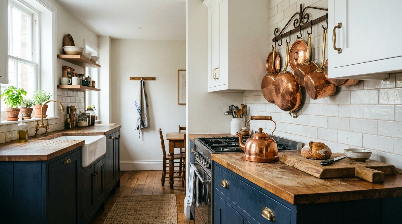
Deep Navy Blue and Warm Copper
There is something incredibly classic about navy blue and white, but adding copper into the mix keeps it from feeling like a predictable coastal cliché. The rich navy blue on a focal wall or the island anchors the room, while copper pendants and copper pots hanging on the wall bring a beautiful, glowing contrast. It feels incredibly cozy, inviting, and full of character.

When bringing this scheme to life, choose a navy paint with deep charcoal undertones so it doesn’t look like primary blue in the afternoon sun. Use warm, medium-toned wood for your flooring or barstools to bridge the gap between the cool blue and the warm white cabinets. Avoid using cold stainless steel accessories where possible, and opt for copper canister sets or a copper bridge faucet instead. Recreating this accent-heavy look can be very budget-friendly, with quality copper accessories and paint costing between $200 and $500.
Terracotta and Matte Black
This color scheme is perfect if you love rich, earthy tones and want a space that feels sun-drenched and welcoming. The warm, clay-like orange of terracotta backsplash tiles or accent walls brings an instant heartbeat to white cabinets. Matte black hardware and light fixtures cut through the warmth, adding a modern, clean line that keeps the kitchen looking structured.

I always recommend starting with terracotta in small doses, like a textured tiled backsplash or clay pendant lights, rather than painting every wall. Pair this with white oak countertops or a light concrete-look quartz to keep the focus on the earthy clay tones. Avoid high-gloss finishes here; the beauty of terracotta lies in its chalky, matte texture. If you are on a tight budget, you can easily get this look by painting an accent wall in a rich clay color and adding a few terracotta planters along your windowsill.
Soft Taupe and Polished Nickel
For those who prefer a soft, neutral palette but want to move away from cold grays, soft taupe is the perfect alternative. Taupe is a beautiful blend of gray and brown that changes gently with the lighting throughout the day. When paired with white cabinets and polished nickel hardware, it creates a subtle, glowing space that feels incredibly comfortable and clean.

To make this neutral look feel alive rather than boring, focus heavily on mixing your textures. Use a textured, glossy taupe subway tile for the backsplash to reflect light, and bring in natural elements like linen Roman shades and light oak cutting boards on the counter. Polished nickel is fantastic here because it has a warmer, slightly golden undertone compared to chrome, which fits the taupe perfectly. A common mistake is using stark white grout with taupe tiles; instead, choose a soft gray or off-white grout to keep the lines soft.
Pale Dusty Blue and White Ash
This color scheme feels like a fresh breath of air on a spring morning. The pale, dusty blue walls or beadboard paneling bring a light, cheerful energy to white cabinets without feeling overly sweet or pastel. When paired with light white ash wood elements, it creates an open, breezy atmosphere that makes even small kitchens feel much larger and brighter.

When styling this look, avoid bright baby blues and instead search for a blue paint that has a heavy dose of gray or slate in it. Pair this with natural woven barstools, brushed nickel cabinet pulls, and a simple white farmhouse sink. To keep it from looking too cold, make sure to bring in warm wood cutting boards and perhaps a small, colorful runner rug in shades of brick red and cream. This setup works beautifully for anyone wanting a relaxed, cottage-inspired feel on a modest budget.
Warm Greige and Walnut
Greige remains a massive favorite for a reason—it bridges the gap between warm beige and cool gray flawlessly. Painting your kitchen walls or a central island in a rich greige provides a soft contrast to bright white cabinets. Adding dark, rich walnut wood through open shelving or a butcher block island top adds incredible depth and a sense of history to the kitchen.
To make this color scheme work, make sure your white cabinets are a warmer, creamy white rather than a stark, blue-white. The rich tones of walnut look best when paired with warm metals like antique brass or bronze. A lot of people overlook this detail, but it changes the entire kitchen when you mix in organic materials like a jute rug or handmade ceramic dishware. This is an incredibly easy look to pull off on a budget, as you can find affordable walnut stain to update your existing wooden shelves or barstool seats.
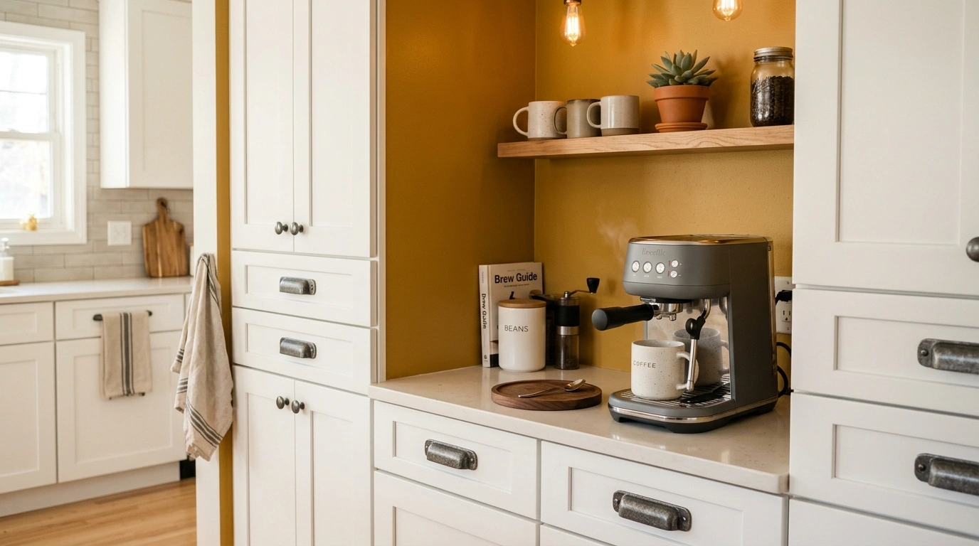
Mustard Yellow and Gunmetal Gray
If you want a kitchen that feels cheerful, bright, and a little bit playful, mustard yellow is an incredible choice. This deep, golden yellow brings a sunny warmth that instantly banishes any clinical feelings from white cabinets. Pairing this warm tone with heavy, gunmetal gray hardware and dark slate floors keeps the yellow feeling grounded, sophisticated, and mature.

To keep this from feeling overwhelming, keep the mustard yellow restricted to an accent area, such as a painted coffee nook, a patterned tile backsplash, or even just some high-quality yellow ceramic dishes on open shelves. Use gunmetal gray for your faucet and cabinet handles to add a modern, industrial edge. Avoid pale, lemony yellows, which can look cheap and dated against white cabinetry. Expect to spend very little to test this look out, as simple decor accents and a can of accent paint can be found for under $100.
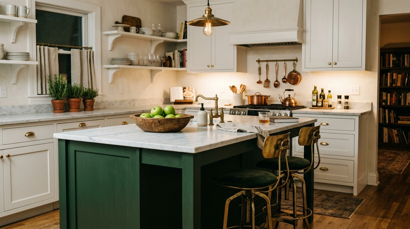
Forest Green and Aged Gold
For a kitchen that feels incredibly rich, cozy, and full of depth, forest green is unmatched. This deep, botanical shade makes white upper cabinets pop beautifully when used on the lower cabinets or a large kitchen island. Aged gold hardware and lighting fixtures sit against the dark green like sunlight filtering through a thick canopy of trees, creating a warm, moody comfort.

When pulling this together, make sure to bring in plenty of bright white elements, like a white quartz countertop or a classic white subway tile backsplash, to keep the dark green from making the kitchen feel like a dark cave. Use warm wood accents, like a walnut knife block or a stained wood ceiling beam, to enhance the forest-inspired vibe. The biggest mistake here is choosing gold hardware that is too shiny and yellow; look for words like “aged,” “antique,” or “champagne” to get that soft, muted gold look.
Dusty Blush and Antique Brass
Blush pink isn’t just for nurseries anymore; when it has a heavy dusty brown undertone, it becomes a gorgeous, sophisticated neutral. This dusty blush tone brings a soft, warm glow to white cabinets, making the kitchen feel incredibly inviting, bright, and unique. Antique brass hardware and plumbing fixtures add a classic, vintage weight that prevents the pink from looking childish.
The key to styling this color scheme is to treat the dusty blush exactly like you would a warm beige. Pair it with light, warm-toned wood floors and simple white quartz countertops. Introduce plenty of fresh greenery in clay pots to balance the pink with natural, vibrant contrast. Avoid high-gloss paint or modern chrome fixtures, which will ruin the cozy, vintage-inspired charm of this palette.
Cream, Matte Black, and Natural Cane
This high-contrast color scheme is perfect if you love a clean, modern look but still want your home to feel deeply textured and organic. By painting the walls a rich, warm cream, you soften the transition to the white cabinets. Adding matte black light fixtures and hardware gives the kitchen sharp, clean lines, while natural cane barstools and woven pendant shades bring in a beautiful, relaxed warmth.

To recreate this look, avoid pure, stark whites for your walls and instead look for creams with warm, yellow-gray undertones. Use natural materials wherever possible—think linen tea towels, seagrass baskets, and light oak cutting boards on the counters. This works especially well if you want your kitchen to look put together without trying too hard, as the simple color palette relies on easy-to-find natural textures rather than complex color matching.
Monochromatic Off-White and Light Maple
Sometimes, the best color scheme is one that plays with very subtle shifts in tone and texture. By pairing your white cabinets with soft off-white walls, a glossy white herringbone tile backsplash, and light maple wood accents, you create an incredibly peaceful, bright, and airy kitchen. It is a minimalist’s dream that still manages to feel cozy, warm, and lived-in.

Because this look uses very little color, texture is absolutely everything. Use a handmade backsplash tile that has natural, uneven surfaces to catch the light, and choose a light maple wood for your island top, barstools, or open shelving to introduce soft, warm wood grains. Use brushed stainless steel or matte black hardware to keep the lines clean and simple. A common mistake here is letting clutter build up on the counters; because the palette is so quiet, keeping your surfaces clean and styled with just a few wooden boards and a bowl of fresh fruit is key.
Conclusion
At the end of the day, creating a beautiful kitchen is all about building a space where you actually want to spend your time. You do not need to spend thousands of dollars on custom cabinetry or high-end renovations to make your kitchen feel cozy and personal. Often, all it takes is a fresh coat of paint on an accent wall, a change of hardware, or some warm wooden open shelves to bring those white cabinets to life.
I always recommend starting with just one or two small changes, like updating your cabinet pulls or painting a small coffee corner, to see how the colors look in your home’s natural light. Your kitchen should be a place of comfort, confidence, and warmth, not a clinical showroom.
Which of these 12 kitchen color schemes white cabinets would you actually want to try in your own home first? I’d genuinely love to know in the comments below!
Q: How do I make my white kitchen cabinets feel warmer?
To make white cabinets feel warmer, introduce natural wood elements like oak or walnut open shelves, warm-toned metal hardware like brass or copper, and paint the walls in a soft, warm neutral like cream or greige rather than stark white.
Q: What color hardware looks best on white cabinets?
Brushed brass and antique bronze look incredible for a warm, traditional feel, while matte black hardware offers a clean, modern contrast. If you prefer silver, polished nickel has a warmer undertone than chrome and looks beautiful with white.
Q: Can I mix two different cabinet colors with white?
Yes, using a darker color like navy blue or forest green on your lower cabinets or kitchen island while keeping your upper cabinets white is a fantastic way to add depth and interest to the room.
Q: What color walls go best with white cabinets?
Soft, muted tones like sage green, dusty blue, warm taupe, and creamy off-white are excellent choices because they provide a soft, comfortable contrast without overwhelming the bright cabinets.
Q: How do I keep a white kitchen from looking sterile?
The best way to avoid a sterile look is by adding plenty of texture, such as a textured tiled backsplash, woven wicker barstools, linen curtains, and natural wood cutting boards styled on the countertops.