13 Red Kitchen Color Schemes That Are Surprisingly Easy
A lot of people love the idea of a bold, cozy kitchen, but they hesitate when it comes to red. It is easy to worry that a bright color will feel overwhelming, make the space look smaller, or look dated after a few months. But in my experience, the biggest mistake people make is thinking they have to paint every single wall a bright fire-engine red to get the look. You do not have to live in a high-stress, neon-bright space to enjoy the warmth and energy of this gorgeous color.
Using red in your home is actually incredibly simple when you pair it with the right supporting shades. By mixing in soft neutrals, warm woods, or surprising accent tones, you can create a space that feels grounded, welcoming, and beautifully put together. Whether you want a cozy cottage feel, a modern loft vibe, or something soft and earthy, these 13 red kitchen color schemes that are surprisingly easy will show you how to pull off the look with confidence. You do not need a massive remodeling budget—just a few smart styling choices to make your kitchen the absolute heart of your home.
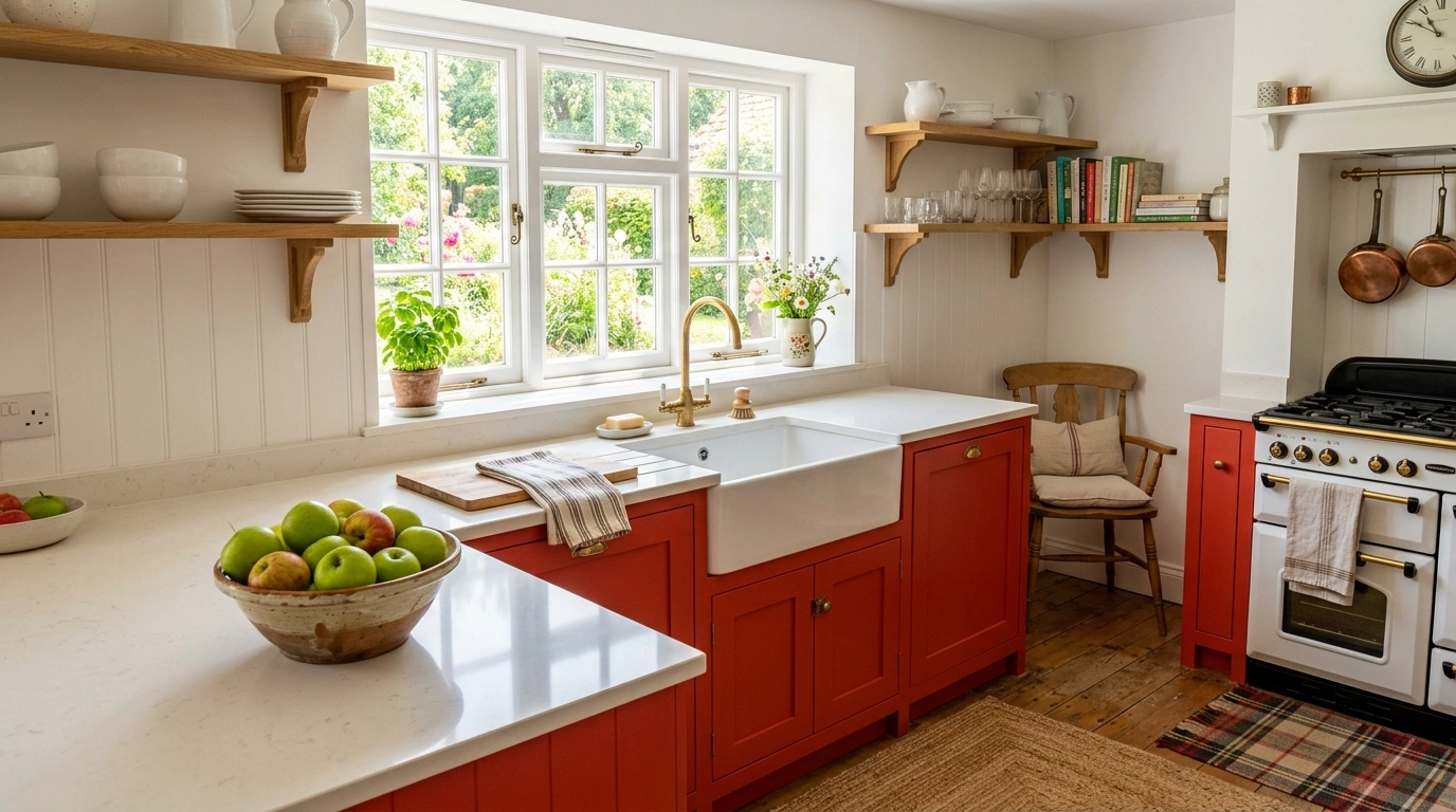
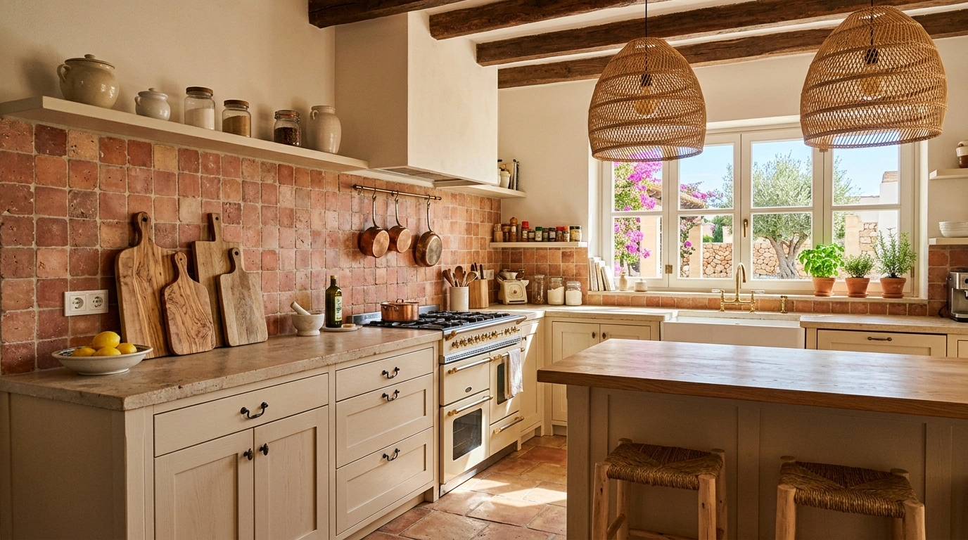
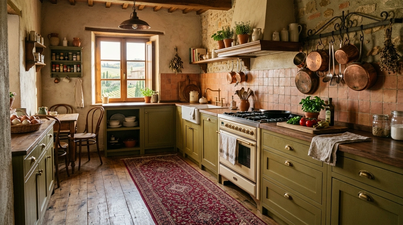
Brick Red and Warm Natural Wood
What I personally love about this look is how incredibly grounded and rustic it feels. By pairing a deep, earthy brick red with open wooden shelving and warm oak or pine countertops, the red ceases to feel loud and instead feels like a natural extension of the forest. This color scheme is perfect for Sunday morning coffee, baking bread, and family gatherings where you want everyone to feel instantly relaxed and at home.
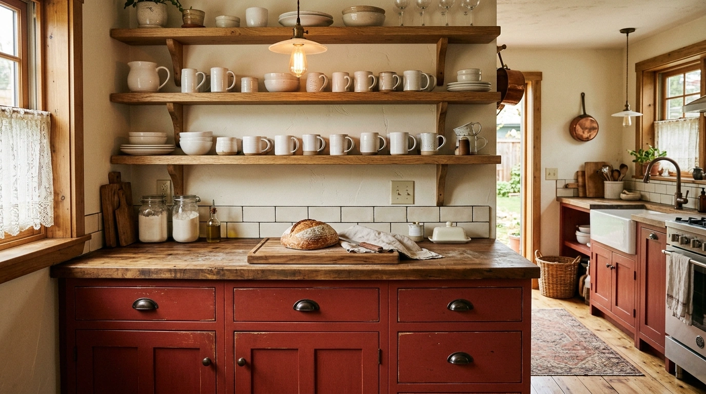
To recreate this, I always recommend starting with a rich, clay-toned brick red paint for either your lower cabinets or a single accent wall. Keep your upper shelves open and made of raw or lightly stained natural wood to keep the space feeling open and airy. For hardware, opt for antique brass or oiled bronze rather than shiny chrome to maintain that rustic charm. A great budget-friendly alternative is to keep your existing white cabinets and simply add a brick-red runner rug and matching linen hand towels.
Suggested Price Range for Accents: $30 – $150
Common Mistake to Avoid: Avoid using high-gloss red paint here; matte or eggshell finishes look much more natural with wood.
Tomato Red and Crisp Soft White
This look is bright, happy, and feels like a sunny morning in a clean, modern cottage. By pairing a cheerful, tomato-toned red with clean, soft white walls and cabinets, the red pops beautifully without making the room feel dark or cramped. It creates an energized, clean environment that makes you want to cook fresh meals and host lively brunch gatherings with friends.
To get this right, use your tomato red in focused, intentional spots—like a painted kitchen island, a retro red refrigerator, or a tiled backsplash—while keeping the surrounding walls and cabinets a clean, soft white. A lot of people overlook this detail, but it changes the entire room if you choose a white paint with warm undertones rather than cold, blue-gray undertones, which can make the red look harsh. Accessorize with white ceramic jars, a bowl of fresh green apples, and simple silver hardware.
Suggested Price Range for Accents: $40 – $200
Common Mistake to Avoid: Don’t paint the ceiling red; keep it bright white to let the light bounce around the room.
Sage Green and Deep Crimson
This might sound like a holiday combination, but when you choose the right muted tones, it actually looks incredibly sophisticated and organic year-round. The cool, earthy qualities of sage green perfectly balance the intense warmth of deep crimson red. It creates a calming, nature-inspired kitchen that feels incredibly unique, comforting, and packed with personal character.
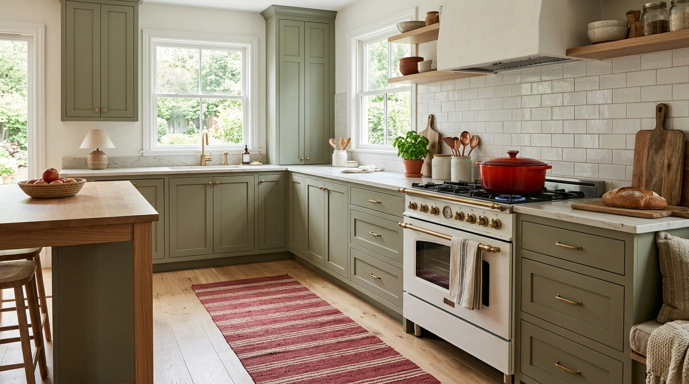
I always recommend starting with sage green as your primary cabinet color, as it is incredibly easy on the eyes and acts as a soft neutral. Then, introduce your crimson red through small but impactful details: a red Dutch oven on the stove, crimson-striped cafe curtains, or a beautiful red vintage rug under the sink. For the countertops, a simple white quartz or light butcher block works beautifully to keep the space feeling fresh.
Suggested Price Range for Accents: $25 – $120
Common Mistake to Avoid: Stay away from bright, primary greens and reds, or your kitchen will look like a Christmas decoration year-round; stick to dusty sage and deep, wine-toned crimsons.
Moody Burgundy and Warm Brass
If you want a kitchen that looks high-end and deeply comforting, this rich, moody color scheme is the absolute best way to do it. Burgundy has a gorgeous, purple-brown undertone that makes it feel much softer and more inviting than bright red. When you pair this rich color with warm brass handles, faucets, and light fixtures, the kitchen instantly glows with warmth and hospitality.
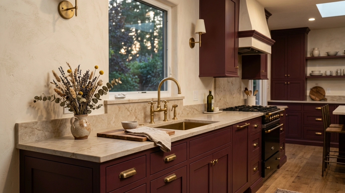
To make this work without trying too hard, paint your base cabinets in a deep, matte burgundy and pair them with a light beige or cream wall color. The warm brass hardware acts like jewelry for your cabinets, catching the light and adding a touch of brightness. If you are on a budget, you can easily achieve this look by spraying your existing cabinet handles with a high-quality satin brass spray paint and painting just your kitchen island burgundy.
Suggested Price Range for Accents: $50 – $180
Common Mistake to Avoid: Avoid black hardware with burgundy, as it can make the overall space look too dark and gloomy.
Charcoal Gray and Poppy Red
For those who love a clean, industrial, or modern look, charcoal gray and poppy red are an incredible team. The dark, cool charcoal provides a highly stable, dramatic backdrop that lets a few pops of bright, energetic poppy red shine. It feels organized, creative, and highly contemporary—ideal for anyone who loves clean lines but still wants their home to feel alive and warm.
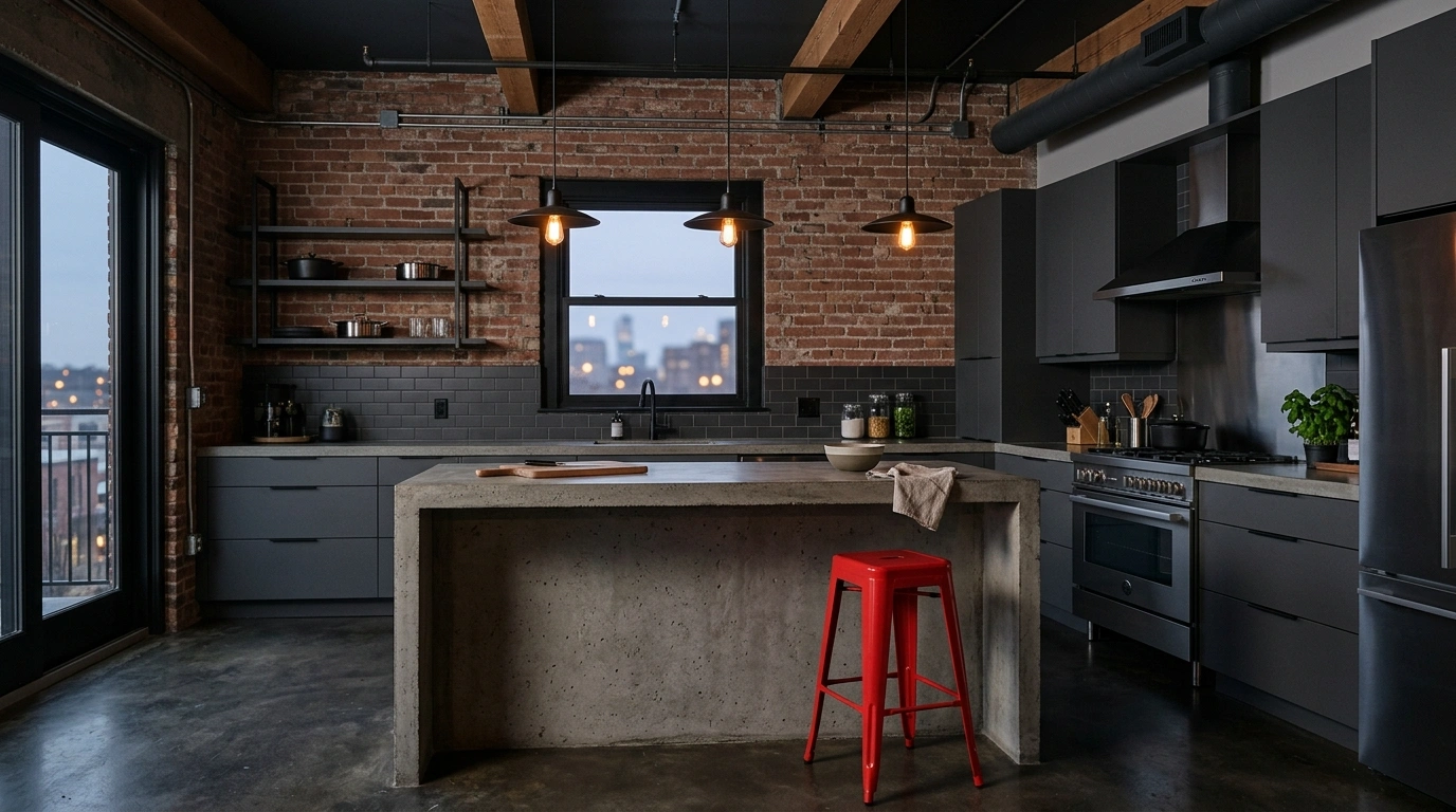
To set this up, paint your walls or cabinets a deep, rich charcoal gray, and use poppy red purely for accent features. This could be a set of red metal barstools at the island, a red pendant light hanging over the sink, or red small appliances on the counter. Keep the countertops simple with concrete-look laminate or gray slate to emphasize that cool, modern industrial texture.
Suggested Price Range for Accents: $45 – $250
Common Mistake to Avoid: Do not overdo the red accents; keep them to three key spots in the room so the charcoal gray remains the dominant, calming force.
Terracotta Red and Creamy Beige
If you love warm, sunny, Mediterranean-inspired spaces, this color scheme is incredibly easy to live with. Terracotta is a beautifully muted, orange-toned red that feels instantly relaxing and sun-baked. Pairing it with a soft, creamy beige instead of stark white creates a gentle, low-contrast kitchen that feels like a quiet sanctuary.
To bring this look to life, use textured terracotta tiles for your backsplash, or paint your walls in a soft, clay-red shade. Pair this with light cream-colored cabinets and natural fiber accents, like woven rattan pendant lights, seagrass baskets, and linen towels. This works especially well if you want a kitchen that looks beautifully designed and put together without feeling stiff or overly formal.
Suggested Price Range for Accents: $35 – $140
Common Mistake to Avoid: Avoid using bright white grout with terracotta tiles; choose a warm beige or gray grout to keep the transition smooth and soft.
Navy Blue and Cherry Red
This classic pairing brings a lovely, clean, maritime or Americana energy to the kitchen without feeling kitschy. Navy blue is a highly structured, trustworthy color that anchors the lower half of the room, while bright cherry red adds a playful, energetic spark. It is a fantastic option for family homes because it is highly durable, hides dirt easily, and feels incredibly cheerful.
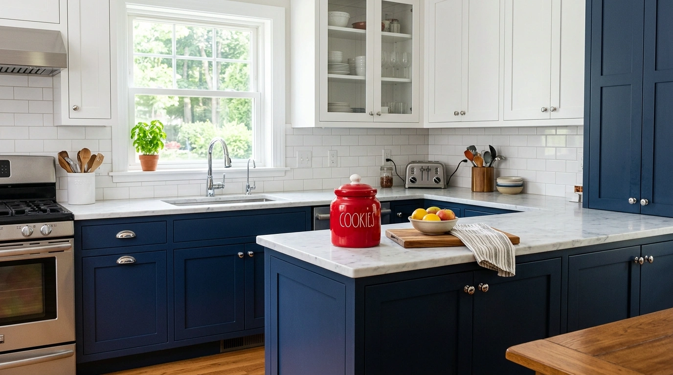
I always recommend painting your lower cabinets a rich navy blue and keeping your upper cabinets a bright, clean white. Then, bring in cherry red through fun, practical accessories like red seat cushions for your dining chairs, a red ceramic cookie jar, or a red-rimmed clock on the wall. For plumbing fixtures, classic polished chrome or stainless steel works beautifully with this maritime-inspired palette.
Suggested Price Range for Accents: $20 – $95
Common Mistake to Avoid: Make sure to keep the upper half of the room light and bright with white paint so the navy and red do not weigh the space down.
Rusty Red and Matte Black
This scheme is incredibly moody, modern, and high-contrast, making it perfect for open-plan homes or urban apartments. The rusty, brown-toned red brings a rustic warmth to the space, while matte black lines and hardware keep it looking sharp, clean, and highly intentional. It is a brilliant way to make a bold design statement that still feels deeply cozy at night under soft lighting.
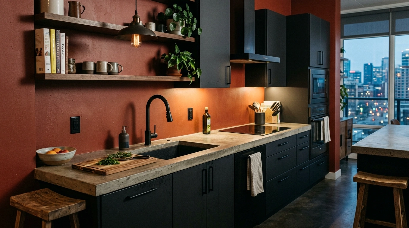
To style this, paint a focal wall or your main cabinet run in a rich, matte rusty red. Introduce matte black through your cabinet handles, a black pull-down faucet, and black metal light fixtures. If you want to keep the budget low, simply install a rusty red peel-and-stick tile backsplash behind your stove and swap your existing cabinet knobs for simple matte black hardware.
Suggested Price Range for Accents: $30 – $160
Common Mistake to Avoid: Avoid high-gloss black finishes here; matte black is much better at hiding fingerprints and looks far more modern.
Cherry Red and Soft Vintage Blue
If you love retro, mid-century, or eclectic design, this playful color combination is a joy to live in. The sweet, cool tones of a soft vintage blue perfectly balance the bright, warm energy of cherry red. It feels incredibly nostalgic, lighthearted, and welcoming—like an old-school diner or a beloved grandmother’s baking kitchen.
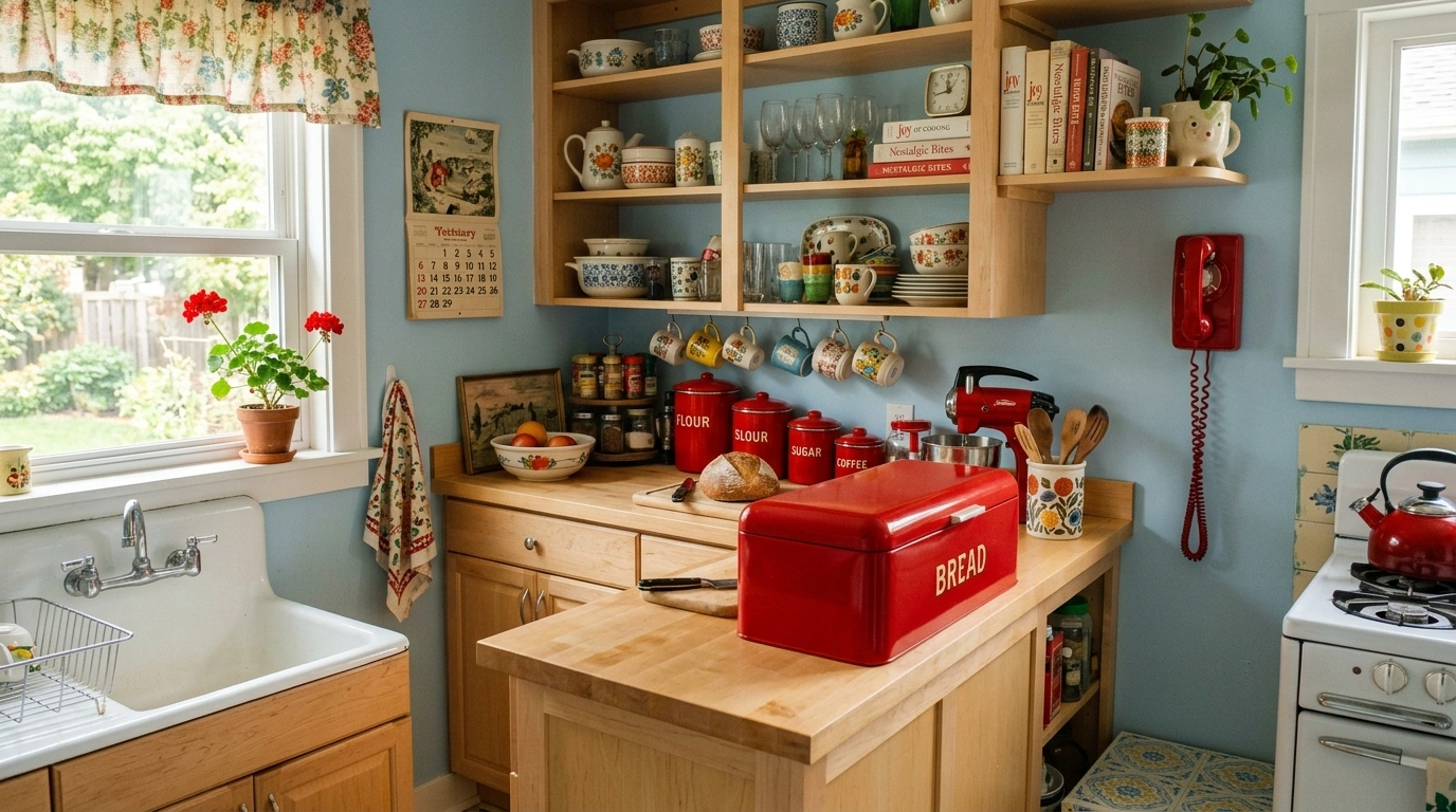
To recreate this vibe, paint your kitchen walls in a very soft, dusty ice blue. Introduce the cherry red through vintage-style accessories, such as a red bread box, a colorful red kitchen scale, or patterned red-and-white curtains. Light-colored wood countertops, like maple or birch, keep the retro theme feeling fresh, light, and wonderfully clean.
Suggested Price Range for Accents: $15 – $85
Common Mistake to Avoid: Keep the blue very pale and dusty; if the blue is too bright, the kitchen will start to look like a playroom rather than a cozy kitchen.
Wine Red and Warm Olive Green
This palette takes its inspiration from the beautiful colors of a Tuscan hillside or a cozy winter vineyard. The rich, purple-toned wine red brings a massive amount of depth and comfort, while the earthy, golden-yellow undertones of olive green keep the space grounded and organic. It is a magnificent scheme for people who love to cook long, slow meals and want their kitchen to feel like a warm, private tavern.
To style this, use olive green as your main cabinet paint color, and choose a rich wine red for your kitchen runner rug, seat cushions, and window treatments. Wood cutting boards, copper pots hanging from a wall rack, and warm yellow lighting will highlight the rich tones in both colors, making the whole kitchen feel incredibly cozy and lived-in.
Suggested Price Range for Accents: $40 – $150
Common Mistake to Avoid: Avoid using cold LED lighting in this space; warm white bulbs (around 2700K) are essential to make these rich colors feel inviting.
Coral Red and Soft Sage
For a kitchen that feels light, breezy, and coastal with a twist, coral red and soft sage are a gorgeous choice. Coral has a beautiful pinkish-orange undertone that feels bright and happy without being aggressive, while sage green brings a cool, leafy calm to the room. It is a wonderful option for smaller kitchens that do not get a ton of natural light, as it naturally brightens up the space.
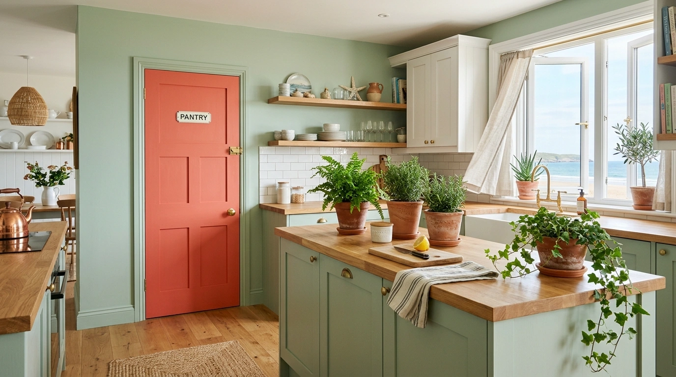
To implement this, keep your walls a soft sage green or pale off-white, and paint your kitchen island or pantry door in a cheerful coral red. Accent the space with natural wood cutting boards, cream-colored ceramics, and fresh green plants in clay pots. This combination feels incredibly creative, fresh, and easy to maintain without requiring a lot of clutter.
Suggested Price Range for Accents: $25 – $110
Common Mistake to Avoid: Stay away from dark woods with this color scheme; light pine, birch, or white oak keep the breezy, happy energy alive.
Crimson Red and Warm Greige
Greige—a beautiful blend of gray and beige—is one of the most popular neutral paint colors for a reason: it is incredibly versatile and soothing. When you pair warm greige cabinets with a bold crimson red accent, the red brings the neutral kitchen to life, while the greige keeps the red from feeling overwhelming. It is a highly professional, balanced, and clean look that is incredibly easy to sell if you ever decide to move.
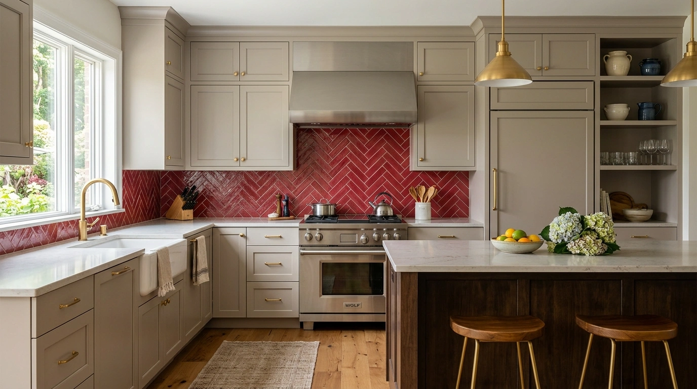
To get this look, paint all of your main cabinets in a warm greige paint. Then, add a stunning crimson red focal point, such as a painted brick accent wall, a red tiled stove niche, or a high-quality red kitchen runner rug. For hardware, both brushed nickel and warm gold work beautifully with greige, giving you plenty of flexibility to match your existing appliances.
Suggested Price Range for Accents: $30 – $130
Common Mistake to Avoid: Make sure the greige paint you choose has warm, sandy undertones rather than cold, blue-gray undertones, so it harmonizes perfectly with the crimson.
Raspberry Red and Honey Oak
If you have a home with beautiful honey oak or pine trim and cabinets from the 80s or 90s, do not paint over them just yet! Raspberry red—a cool, pink-toned red—looks incredibly beautiful next to the warm, golden tones of honey oak. The cool pink undertones in the raspberry naturally balance the yellow-orange tones in the wood, making your existing cabinets look modern and highly intentional.
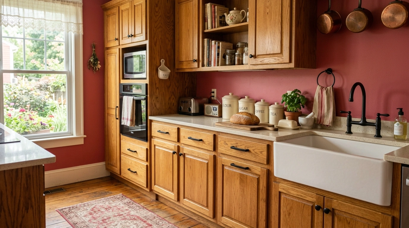
To pull this off, paint your kitchen walls in a soft, muted raspberry red, or use a gorgeous floral wallpaper that features raspberry and cream tones. Keep your honey oak cabinets as they are, but clean them thoroughly and install simple, clean matte-black or modern brass knobs. Add a few cream-colored accessories to keep the overall look bright, fresh, and deeply nostalgic.
Suggested Price Range for Accents: $20 – $100
Common Mistake to Avoid: Avoid bright orange-reds with honey oak, as they will compete with the wood and make the kitchen look overly yellow; stick to cool, pink-toned raspberry shades.
Conclusion
At the end of the day, creating a beautiful home is all about confidence over perfection. You do not need a massive budget or a team of professional designers to make a bold color like red work in your home. The secret lies in starting small and balancing the warmth of the red with grounding neutrals, cozy wood textures, or soft complementary colors.
If you are feeling a little nervous, I always recommend trying just one or two small ideas first. Paint a single accent wall, swap out your kitchen runner rug, or display a few beautiful red ceramic pots on your countertops to see how the color feels in your daily life. You might be surprised by how much energy, warmth, and joy a little bit of red can bring to your morning routine.
Which of these red kitchen color schemes would you actually love to try in your own home first? I would genuinely love to know!
Frequently Asked Questions
How do I make a red kitchen look modern instead of dated?
To keep a red kitchen looking fresh and modern, avoid using high-gloss primary reds on every single wall. Instead, pair a muted or deep shade of red with clean neutrals like warm greige, soft cream, or charcoal gray, and use matte finishes rather than shiny ones.
What hardware finishes look best with red cabinets?
Warm brass and satin gold look absolutely incredible with deep red and burgundy cabinets because they highlight the color’s natural warmth. For brighter reds or rustic schemes, matte black or oiled bronze hardware provides a clean, grounded look.
Will painting my kitchen red make the room look smaller?
It can if you paint every wall a dark red, but you can easily avoid this. Keep your upper walls and ceiling bright white or cream, and use red on the lower cabinets or a single focal point to draw the eye without closing in the space.
How can I add red to my kitchen without painting the cabinets?
The easiest way is through textiles and accessories. Add a vintage red runner rug, hang red linen cafe curtains, display red cast-iron cookware on your stove, or use open shelving to show off red ceramic plates and mugs.
What is the most calming shade of red for a kitchen?
Terracotta and clay reds are by far the most calming because they have soft, warm orange and brown undertones. They feel organic and sun-baked rather than high-energy, making them incredibly easy to live with day in and day out.