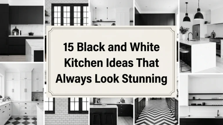
12 Best Kitchen Color Schemes With Dark Floor
Choosing kitchen color schemes with dark floor is one of those design challenges that can make even the most confident home decorator second-guess themselves. When you are staring at a deep espresso wood, rich charcoal tile, or dark slate floor, it is easy to worry that your kitchen will end up feeling like a gloomy, cramped cave. We often choose dark flooring because it looks grounded, hides daily wear and tear beautifully, and adds instant character to a home. Yet, finding the right balance of wall paint, cabinet colors, and hardware to match that heavy base requires a thoughtful touch.
In my experience, the biggest mistake people make is trying to fight the dark floor by making everything else in the kitchen a stark, sterile white. This creates an incredibly harsh, high-contrast look that feels cold and unfinished rather than intentional. Building a home you love is all about finding a balance between comfort, daily durability, and your own personal style. Small changes—like opting for a soft cream instead of bright white, adding warm wood accents, or choosing brass hardware—can completely change how your dark floor behaves in the space. In this guide, I will walk you through 12 real-world kitchen color schemes with dark floor that will make your kitchen feel warm, balanced, and perfectly styled.
Soft Sage Green, Cream, and Warm Walnut Floors
What I personally love about this look is how the soft, earthy sage green cabinets gently bridge the gap between the dark, rich walnut floor and a bright ceiling. The muted green feels incredibly calming and fresh, bringing a touch of the outdoors inside without overwhelming the room. It feels comfortable and grounded, making the kitchen a soothing place to enjoy a quiet cup of coffee on a slow weekend morning.
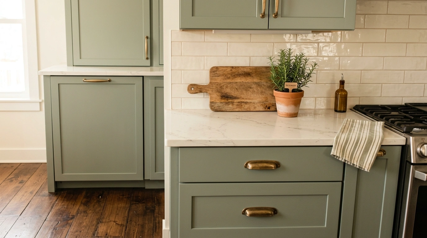
To get this look right, I always recommend starting with a soft cream paint for the upper cabinets or walls rather than a cool white. The cream acts as a soft buffer, highlighting the organic tones in the dark walnut. Pair this color scheme with brushed brass hardware and a simple white oak cutting board on the counter to bring out the golden undertones of the floor.
Common Mistake to Avoid: Choosing a sage green that is too cool or blue-toned, which can clash with the warm, red, or orange undertones in walnut wood.
Suggested Price/Material Focus: Satin-finish painted cabinets paired with warm brass pulls (average hardware upgrade: $150–$300).
Warm Terracotta, Off-White, and Charcoal Slate Floors
For those who love an earthy, slightly rustic vibe, pairing warm terracotta accents with off-white cabinets and dark charcoal slate floors is incredibly charming. The natural, fired-clay warmth of terracotta injects an instant sense of life and history into the space, directly balancing the cool, stony weight of slate. It feels like a welcoming, sun-drenched cottage kitchen where everyone naturally gathers to talk and share a meal.
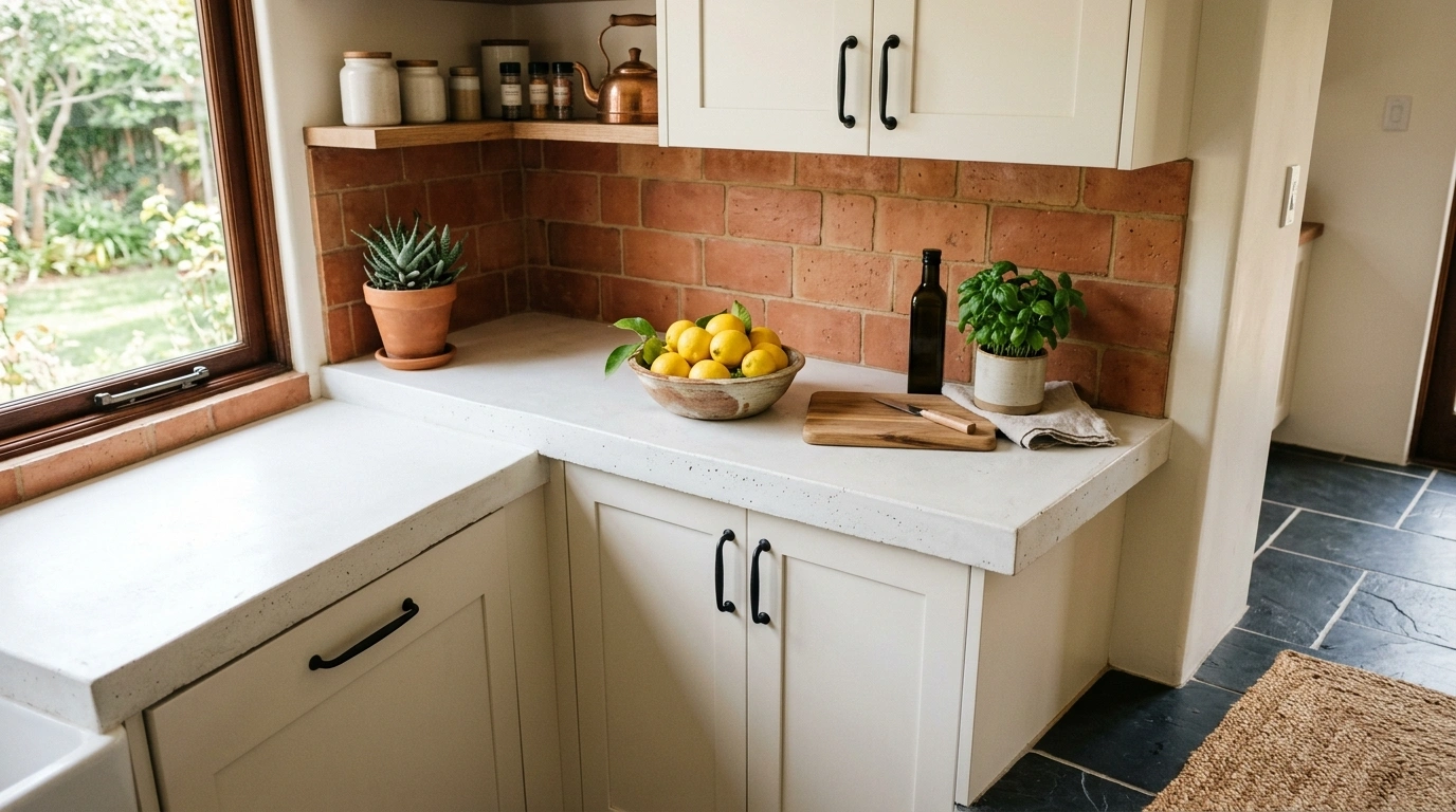
When laying out this color scheme, use the terracotta selectively—perhaps on a kitchen island, a tiled backsplash, or open shelving—while keeping the main run of cabinets a soft, warm off-white. This prevents the rich orange-red tones from taking over the room. I always suggest pairing this setup with oil-rubbed bronze or matte black hardware to tie back to the dark gray slate floor.
Common Mistake to Avoid: Overusing terracotta on every cabinet door, which can make a medium-sized kitchen feel visually heavy and small.
Suggested Price/Material Focus: Textured terracotta tiles or accent paint paired with dark slate tiling ($12–$18 per square foot).
Matte Black, Warm Oak, and Espresso Wood Floors
If you want to create a kitchen that feels incredibly sophisticated, moody, and grounded, matte black paired with warm oak is an amazing choice. By using deep black on your lower cabinets and natural oak on your upper shelves or island, you create a beautiful gradient that flows naturally into an espresso wood floor. It feels quiet, high-end, and cozy, especially when the evening lights are dimmed.
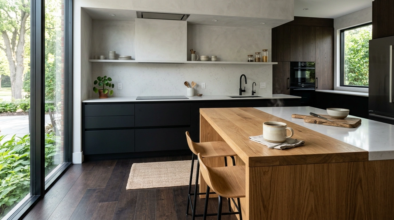
To keep this from looking too dark, I suggest running a light, textured plaster or creamy subway tile backsplash all the way up to the ceiling. Stick to clean, minimalist cabinet hardware in antique bronze or even a handleless push-to-open design to let the wood grain do the talking. Since matte black surfaces show fingerprints more easily, opt for high-quality, smudge-resistant finishes.
Common Mistake to Avoid: Using dark black countertops alongside black cabinets and dark floors, which removes all visual separation and flattens the space.
Suggested Price/Material Focus: High-quality flat-panel oak laminate and matte black cabinetry finishes ($150–$250 per cabinet door).
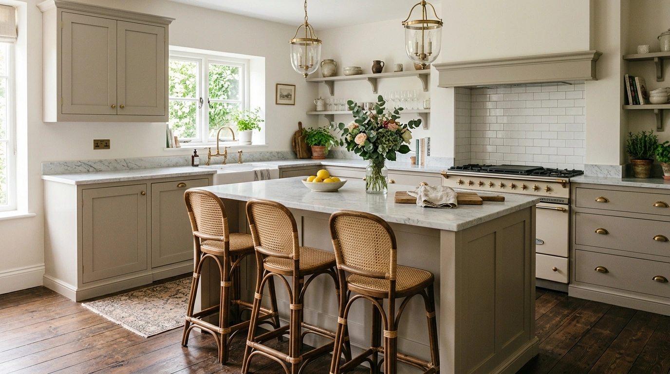
Creamy Taupe, Brass, and Dark Oak Floors
Taupe is a wonderful neutral chameleon—a soft, warm mix of gray and brown that brings a quiet, tailored look to a kitchen with dark oak floors. Because taupe has natural brown undertones, it coordinates with the dark wood floor beautifully, making the entire room feel cohesive and incredibly easy on the eyes. It is a subtle, comfortable look that feels classic without feeling dated.
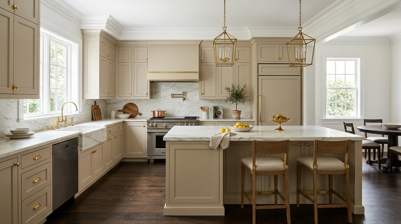
I always recommend choosing a creamy taupe with a warm undertone rather than a cool, purple-leaning taupe. Paint both your upper and lower cabinets in this shade, and use a crisp, bright white paint for your ceiling and window trim to keep the space feeling open. Pair this setup with unlacquered brass hardware, which will develop a beautiful patina over time and complement the warm taupe beautifully.
Common Mistake to Avoid: Using cool white lightbulbs, which can make the taupe paint look gray, muddy, and flat; stick to warm-white light ($2700\text{ K}$ or $3000\text{ K}$).
Suggested Price/Material Focus: Professional cabinet painting in a custom taupe shade ($1,500–$4,000 depending on kitchen size).
Muted Navy, Soft Gray, and Dark Ebony Floors
If you want a classic look with a clear, intentional splash of color, muted navy blue paired with soft gray is an excellent option. Navy blue is deep enough to match the visual weight of dark ebony floors, while a soft gray on the walls or upper cabinets lifts the eye and makes the room feel airy. It feels secure, clean, and classic—reminiscent of a cozy coastal home on a stormy afternoon.
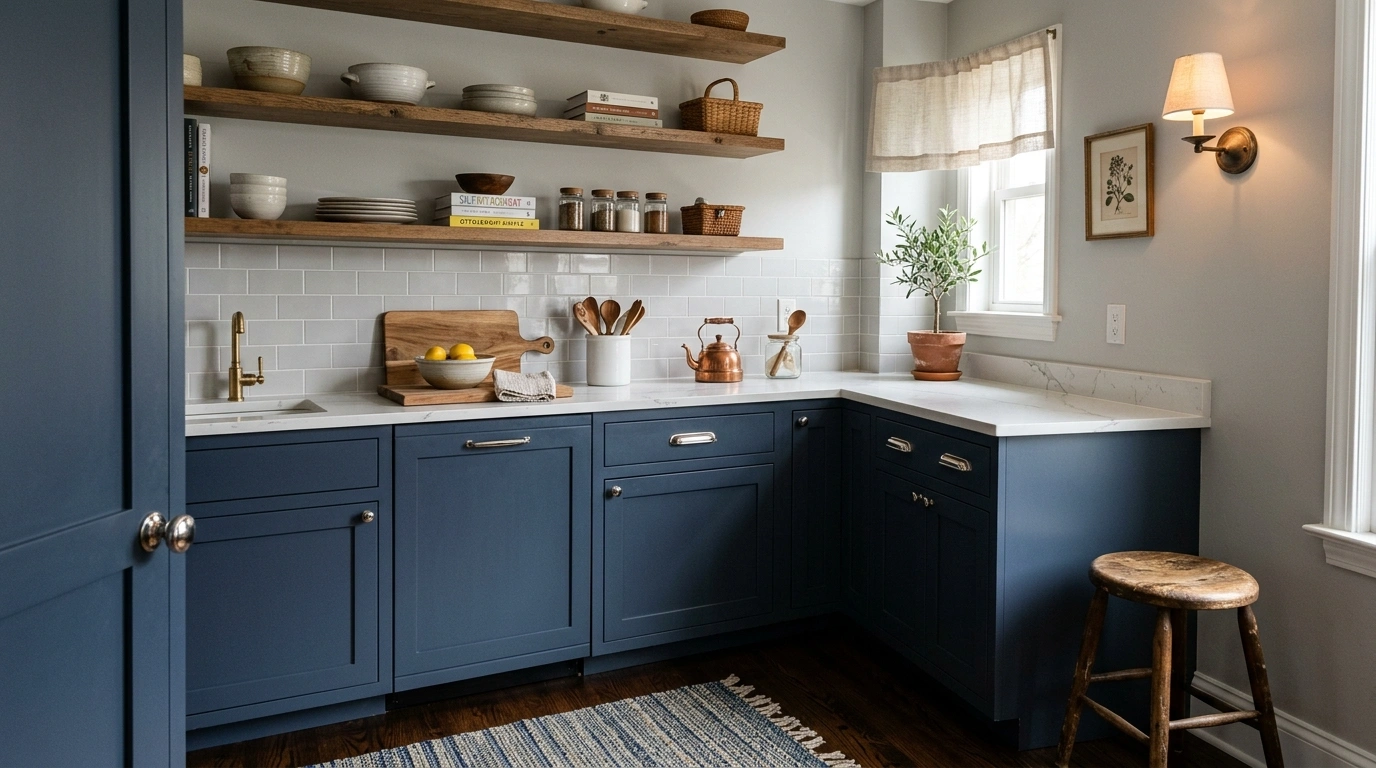
What I love about this look is using navy blue purely for the kitchen island or lower cabinets, creating a solid, grounded anchor. Keep your countertops light—such as a white quartz with delicate gray veining—to act as a bright divider between the navy cabinets and the dark floor. Finish the look with polished nickel hardware to bring out the cool, clean tones of the gray and navy.
Common Mistake to Avoid: Choosing a bright, saturated royal blue instead of a muted navy; royal blue can look too youthful and loud next to a dark ebony floor.
Suggested Price/Material Focus: Muted navy blue shaker cabinets and quartz countertops ($50–$90 per square foot for quartz).
Forest Green, Warm Cream, and Dark Chocolate Wood Floors
Forest green is a rich, heritage-inspired color that pairs spectacularly with dark chocolate wood floors. It creates a deeply comforting, organic atmosphere that makes the kitchen feel grounded and packed with character. When combined with warm cream walls and natural wood accents, this color scheme feels like a cozy, historic library turned into a functional gathering space.
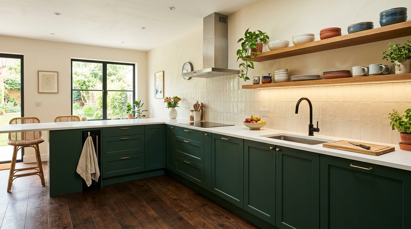
To make this layout feel balanced, use forest green on the lower cabinets and a soft cream on the upper walls. A lot of people overlook this detail, but introducing a natural wood element—like a butcher block countertop on the island or natural oak floating shelves—seamlessly connects the green paint to the dark floor. Accent this look with warm, antique gold hardware.
Common Mistake to Avoid: Leaving out warm under-cabinet lighting, which can cause the deep forest green to look black in the corners of the kitchen.
Suggested Price/Material Focus: Deep forest green satin paint and natural wood accent details ($200–$500 for floating shelves and hardware upgrades).
Dusty Blue, Warm Wood, and Dark Granite Floors
This works especially well if you want a kitchen that feels bright, gentle, and highly inviting. Dusty blue has a soft, gray-tinted quality that keeps it feeling like a neutral while adding a lovely, serene wash of color. Paired with dark gray granite floors and warm natural wood accents, it creates a wonderful balance of cool tones and warm comfort.
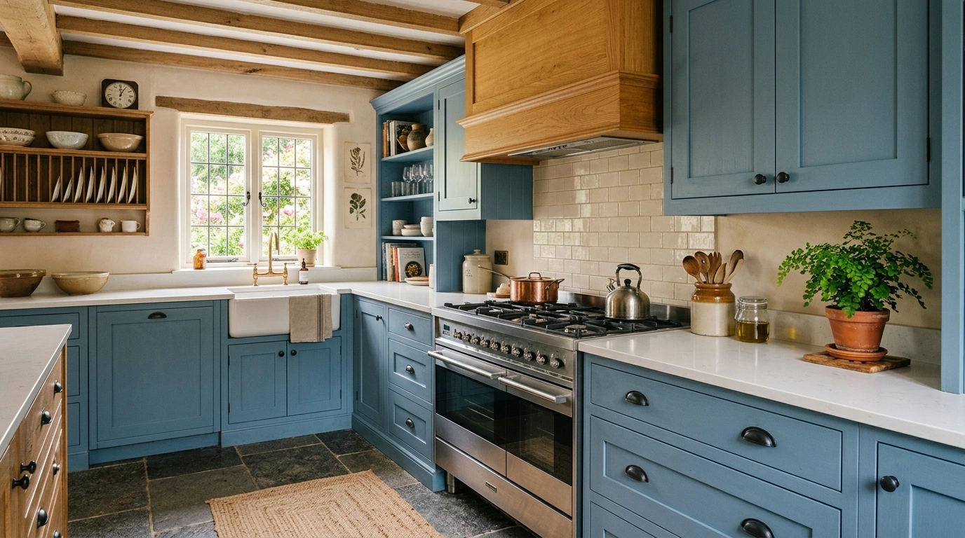
I always suggest using dusty blue on all the main cabinets, then incorporating a warm wood tone, like honey oak or cherry, on your range hood cover or a freestanding pantry cabinet. Use a clean white grout with a light backsplash to keep the transition between the blue cabinets and the dark floor soft and bright. This color palette looks beautiful with matte black hardware.
Common Mistake to Avoid: Pairing dusty blue with dark, busy, heavily speckled granite countertops; a simple, solid white countertop works much better.
Suggested Price/Material Focus: Painted wood cabinets with matte black hardware ($5\text{–}10\text{ dollars}$ per pull).
Soft Greige, Warm White, and Dark Pine Floors
Greige—the perfect blend of gray and beige—is an incredibly reliable color choice for kitchens with dark, rustic pine flooring. The beige tones in greige pull out the natural, warm grain of the dark pine, while the gray undertones keep the kitchen looking clean, modern, and bright. It feels incredibly clean and airy without the clinical, cold look of a plain white kitchen.
To get the most out of this look, paint your cabinets a soft greige and your walls a warm, soft white. This creates a subtle, two-tone contrast that makes the cabinetry look custom-built. Style the space with natural woven textures, like rattan barstools and linen roman shades, to play up the relaxed, comfortable feel of the dark pine floors.
Common Mistake to Avoid: Choosing a cold, blue-toned gray instead of greige, which can make natural dark pine floors look yellow or orange.
Suggested Price/Material Focus: Greige cabinet paint paired with natural linen and rattan accents ($100–$250 for styling pieces).
Charcoal Gray, Bright Brass, and Dark Walnut Planks
For a kitchen that feels sleek, modern, and highly architectural, charcoal gray is a gorgeous option. By choosing a charcoal paint that is just a shade lighter than your dark walnut plank floors, you create a very sophisticated, monochromatic gradient. It feels moody, grounded, and extremely clean, working beautifully in open-concept homes that get plenty of natural daylight.
To keep this from looking flat, bright brass hardware is an absolute must-have. The glowing gold metal cuts through the dark charcoal and walnut, acting like jewelry for your cabinets. Use a white marble countertop with heavy gray veining to add texture and break up the solid blocks of dark gray and rich brown.
Common Mistake to Avoid: Skipping natural elements; without a few plants or a wooden bowl, this dark palette can start to feel a bit too clinical.
Suggested Price/Material Focus: Flat-panel charcoal cabinetry and high-contrast brass pulls ($15–$30 per pull for high-end brass).
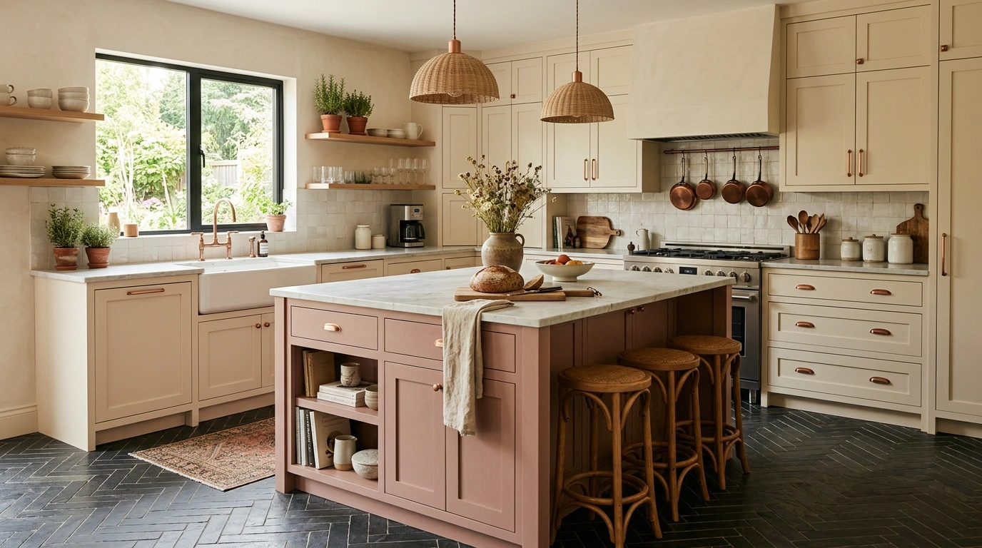
Soft Rose, Warm Cream, and Dark Slate Herringbone Floors
If your style leans a bit more creative, romantic, and playful, pairing a muted, dusty rose with warm cream and dark slate herringbone floors is a stunning choice. The soft rose brings a gentle, surprising warmth to the space, while the dark slate in a herringbone pattern provides a heavy, structured geometric base that keeps the kitchen looking sophisticated rather than overly sweet.
I recommend using dusty rose selectively—such as on the kitchen island or a single accent wall—while keeping the main run of cabinets a soft cream. This creates a cozy, inviting focal point. Tie the look together with brushed copper or rose gold hardware, which coordinates beautifully with the pink and cream tones.
Common Mistake to Avoid: Using a bright, pastel pink instead of a dusty, gray-undertoned rose; a dusty rose acts as a neutral, whereas pastel pink can look juvenile.
Suggested Price/Material Focus: Accent island painting and slate floor tile installation ($15–$22 per square foot for slate tiles).
All-White, Warm Oak, and Dark Wenge Floors
You can absolutely have a white kitchen with very dark wenge floors, but the key to making it work is introducing warm oak wood. Without the warm wood, the stark white cabinets and near-black floors will look extremely harsh and disconnected. The natural oak wood acts as a bridge, bringing organic warmth and texture that ties the high-contrast elements together beautifully.
I suggest painting your cabinets a soft, warm white rather than a cool, blue-white. Use natural white oak for your countertops, open floating shelves, or the underside of your kitchen island. This creates a comfortable, balanced look that feels clean and modern without losing its cozy, family-friendly heart. Style with simple matte black hardware to echo the dark wenge floor.
Common Mistake to Avoid: Choosing a high-gloss white cabinet finish, which reflects the dark floor and can make your upper cabinets look gray and dingy.
Suggested Price/Material Focus: Soft white painted shaker cabinets paired with white oak accents ($300–$600 for oak butcher block accents).
Muted Mustard, Soft Olive, and Deep Espresso Floors
For a kitchen that feels artistic, warm, and highly personal, a color scheme of muted mustard yellow and soft olive green is incredibly cozy. These deep, organic tones work beautifully with dark espresso floors because they share the same rich, earthy warmth. It feels like a vintage European kitchen where slow-simmered sauces are made on a Sunday afternoon.
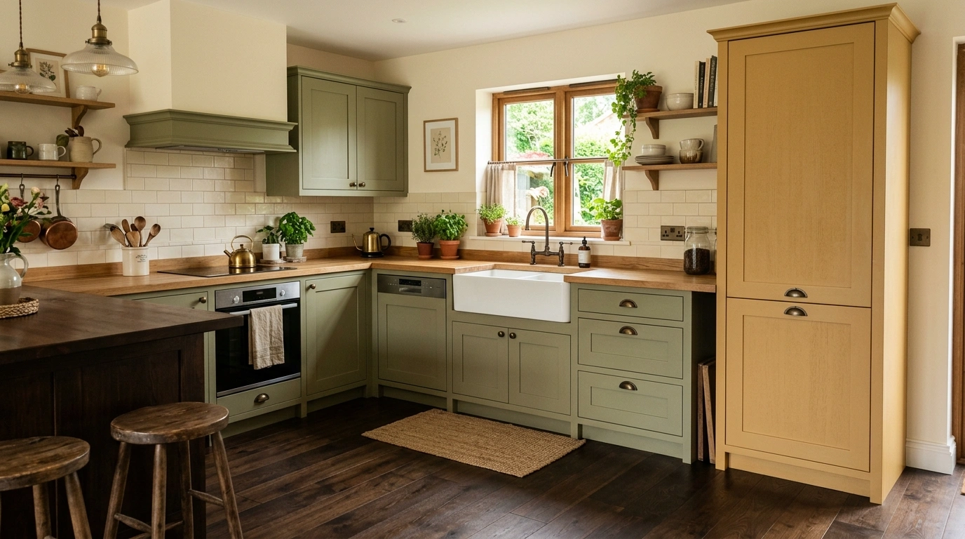
To make this work without looking chaotic, paint your lower cabinets a muted olive green and use a soft, warm mustard color for a hutch, pantry cabinet, or tiled backsplash. Keep your walls a neutral cream to give the eyes a place to rest. Pair this unique palette with dark, antiqued brass hardware and a farm-style copper sink to lean into the historic, cozy feel.
Common Mistake to Avoid: Using bright, primary yellow and green; the colors must be muted, dusty, and earthy to look sophisticated against espresso floors.
Suggested Price/Material Focus: Earthy green and mustard paints paired with antique brass accents ($100–$300 for vintage-style lighting fixtures).
Conclusion
At the end of the day, designing your kitchen should be an exciting journey of expressing your personal style, rather than a source of stress. Your kitchen is the heart of your home—it is where morning coffees are shared, weekend meals are prepped, and memories are made. While a dark floor provides a clean, sturdy canvas, it is the overall kitchen color schemes with dark floor that bring the space to life and make it truly feel like home.
You do not need to spend a fortune on high-end materials to create a space that looks polished and welcoming. Simple, budget-friendly choices like selecting a warm cream cabinet paint or adding natural wood floating shelves can make a dark floor look incredibly expensive and intentional when installed with care and attention to detail. I always recommend starting with just one or two paint samples and a tile swatch—bring them into your kitchen, lean them against your dark floor under your cabinet lights, and watch how they change throughout the day before making your final choice.
Which of these kitchen color schemes with dark floor ideas would you love to see in your own home? I’d genuinely love to hear about your design plans in the comments below!
Q: Do dark floors make a small kitchen look smaller?
Not necessarily. While light floors bounce more light, dark floors create depth and a sense of grounding. In my experience, the biggest mistake people make is painting the walls and cabinets dark too. Keeping your upper walls and cabinets a light cream or soft gray will keep a small kitchen feeling open and airy.
Q: What cabinet color looks best with dark floors?
Soft, warm neutrals like cream, warm taupe, and greige look fantastic because they soften the transition to the dark floor. Earthy, muted tones like sage green, forest green, and dusty blue also work beautifully by adding color without creating a harsh, high-contrast look.
Q: Should my kitchen island match my dark floor color?
It does not have to match. In fact, matching your island exactly to your floor can make the middle of your kitchen look like a dark, heavy block. I recommend choosing a contrasting shade—like warm oak, sage green, or soft cream—to make the island stand out as a beautiful focal point.
Q: How do I keep a kitchen with dark floors from feeling too dark?
The secret is focusing on lighting and high-contrast surfaces. Use bright white or cream countertops, keep your backsplash light, and install warm under-cabinet LED strip lights. This reflects light back into the room and prevents dark corners.
Q: What wall paint colors work best with a dark floor kitchen?
I always recommend soft, warm whites, light creams, and pale grays. Avoid cool, blue-toned whites, which can look blue-gray and cold next to dark flooring. Warm neutrals will naturally highlight the rich tones in your dark floors.