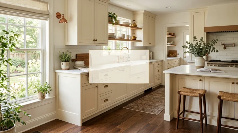
21 Kitchen Backsplash Ideas For White Cabinets That Don’t Look Boring
Choosing a kitchen backsplash for white cabinets is one of those design decisions that sounds incredibly easy until you are actually staring at fifty different shades of ceramic tile samples at three in the afternoon. We often choose white cabinets because they make a room look clean, bright, and spacious. However, without the right accent, an all-white kitchen can quickly start to feel like a cold, sterile doctor’s office rather than a cozy place where your family wants to gather.
In my experience, the biggest mistake people make is choosing a tile that matches their cabinets exactly without adding any texture, which makes the whole space look completely flat. Building a home you love is all about finding the balance between comfort, daily practicality, and your own personal style. Small changes like swapping your grout color, tilting a tile vertically, or choosing a textured glaze can completely alter the way your kitchen feels when the morning sun hits it. In this guide, I will take you through 21 real-world backsplash ideas that will make your white cabinets look incredibly intentional, warm, and polished without feeling like you tried too hard.
Handcrafted White Zellige Tile
What I personally love about this look is how the uneven edges and slight color variations prevent the white-on-white design from looking flat or sterile. Each tile has a unique, glossy glaze that reflects natural light in different directions, making the kitchen feel bright, warm, and deeply personal. It is perfect for a busy family kitchen because the organic, slightly imperfect texture naturally hides minor splatters and water spots. You get all the benefits of a bright kitchen without the pressure of keeping a perfectly polished surface.
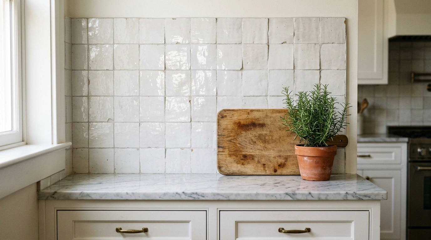
To get this look right, I always recommend starting with a very thin grout line and choosing a grout color that matches the tile, like a soft off-white or cream. Because the tiles are handmade and naturally uneven, using a dark contrast grout can make the wall look way too busy and chaotic. Pair this tile with warm brass cabinet pulls and a simple wood cutting board leaning against the wall to bring out the earthy undertones of the glaze.
Common Mistake to Avoid: Buying machine-made “Zellige-look” tiles that are perfectly flat; they won’t catch the light the same way.
Suggested Price Range: $15–$22 per square foot.
Classic White Subway Tile with Warm Gray Grout
This look works especially well if you want a clean, familiar style but want to avoid the cold look of white tile with bright white grout. By using a standard $3 \times 6$ inch subway tile but pairing it with a soft gray grout, you outline the shape of each tile and give the wall some structure. It feels incredibly cozy and grounded, making it a great backdrop for a Saturday morning breakfast with pancake batter on the counter.
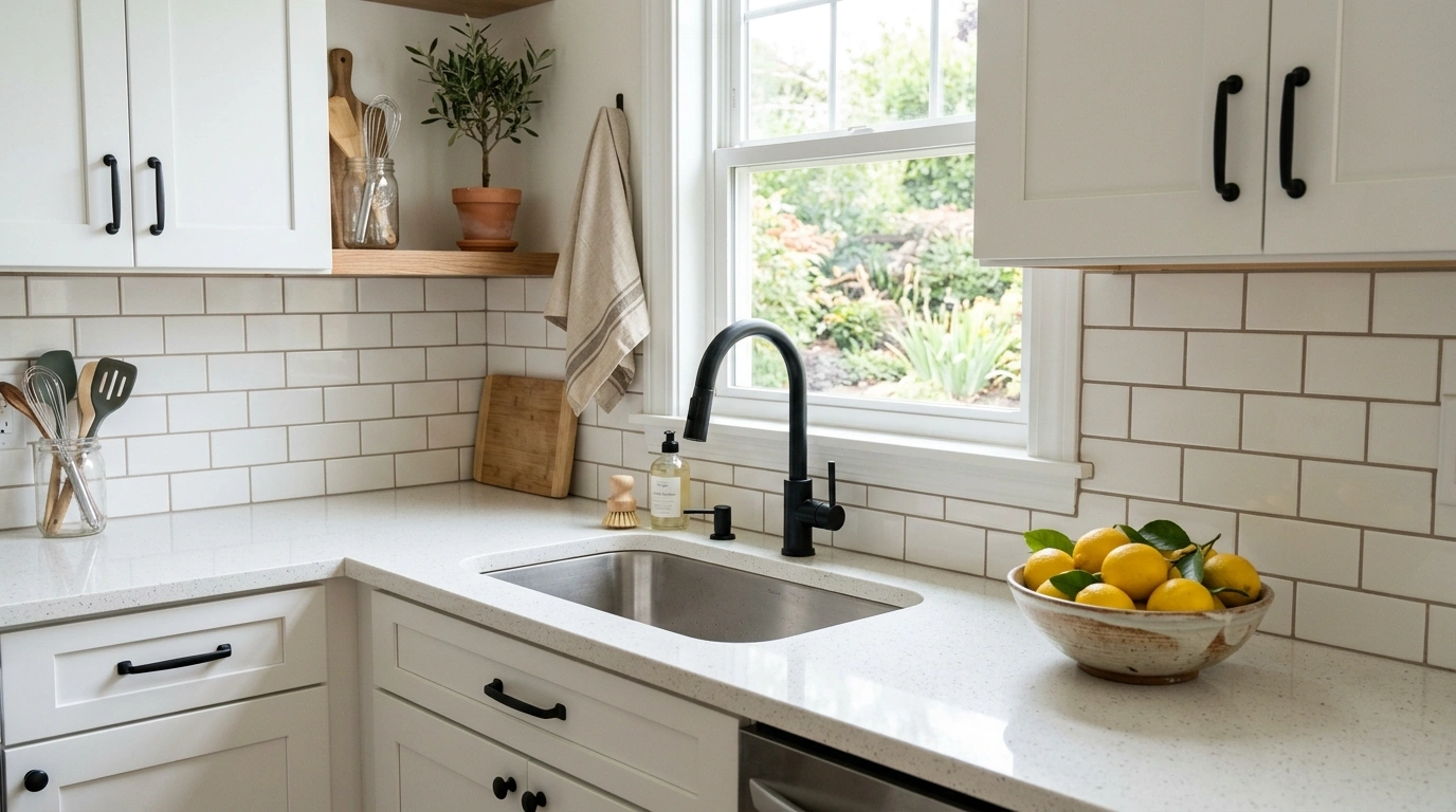
When laying this out, a traditional running bond pattern is your safest bet for a comfortable, classic vibe. The key here is the grout color choice—make sure you ask for a warm gray rather than a blue-toned cool gray, which can look a bit too industrial. This pairing looks fantastic with matte black cabinet hardware, as the black metal ties back to the soft gray lines in the tile wall.
Common Mistake to Avoid: Using dark black grout, which creates a high-contrast, harsh grid look that can feel very dated and aggressive.
Suggested Price Range: $3–$6 per square foot.
Matte Black Herringbone Tile
If you want to make your white cabinets pop, a high-contrast matte black backsplash is an amazing way to do it. The herringbone pattern adds a sense of movement and energy to the wall, turning the space between your counter and upper cabinets into a beautiful focal point. It feels moody, grounded, and incredibly sophisticated, working beautifully in kitchens that get plenty of natural light.
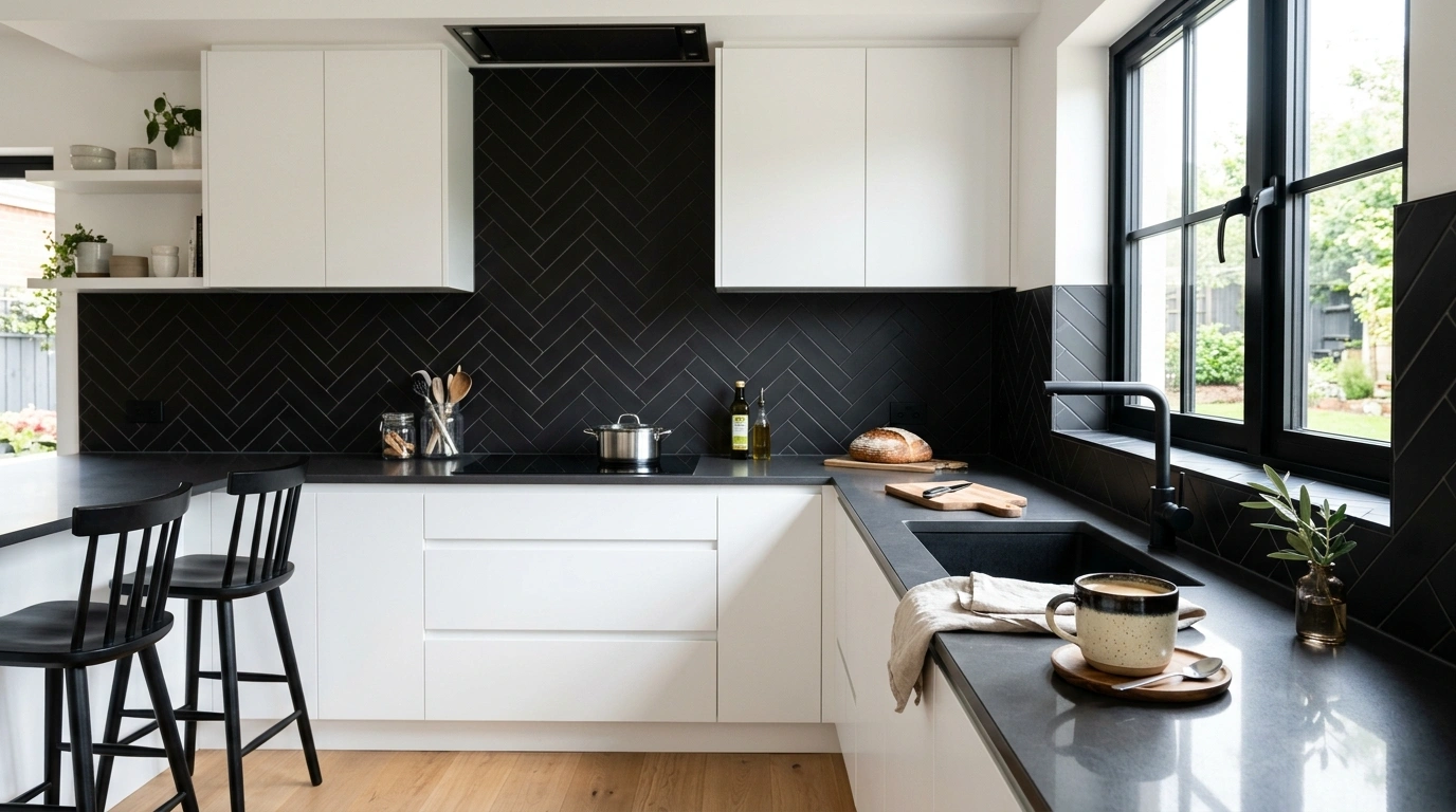
To keep this from looking too dark or heavy, I suggest running the herringbone pattern all the way up to the ceiling behind an open range hood if your layout allows. Stick to a dark charcoal or black grout to keep the lines clean and subtle. Since the tile is matte, it does show dust and flour splatters a bit more than glossy tiles, so keep a soft microfiber cloth handy for quick wipe-downs.
Common Mistake to Avoid: Pairing matte black tile with high-gloss black countertops, which can clash and look overly shiny.
Suggested Price Range: $8–$14 per square foot.
Calacatta Gold Marble Slab Backsplash
A lot of people overlook this detail, but continuing your countertop material straight up the wall as a solid slab completely changes the entire room. Using a marble with warm gold and soft gray veins breaks up the bright white cabinets with a beautiful, natural flow. It feels luxurious, quiet, and extremely clean because there are absolutely no grout lines to scrub after cooking a messy pasta sauce.
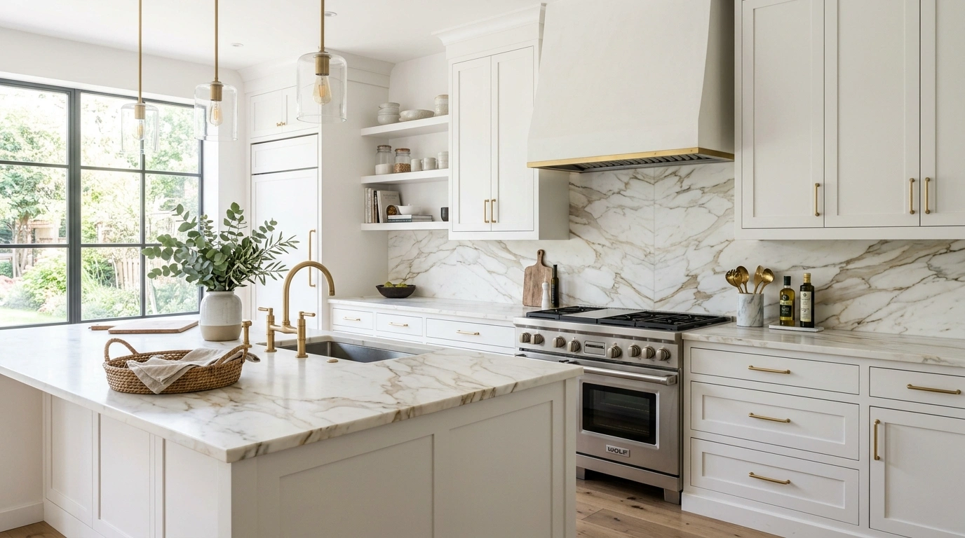
Because natural marble is porous, I always recommend sealing it twice a year to prevent oil and lemon juice from leaving permanent stains behind the stove. If you are worried about the maintenance or the high price tag of natural stone, high-quality quartz slabs can give you the exact same look with zero maintenance. Pair this with simple, minimalist cabinet doors to let the natural pattern of the stone do all the talking.
Common Mistake to Avoid: Forgetting to look at the exact slab in person at the stone yard; vein patterns vary wildly and you want to choose the exact piece being cut.
Suggested Price Range: $50–$90 per square foot (including fabrication and installation).
Muted Olive Green Ceramic Subway Tile
This works especially well if you want to bring a bit of the outdoors inside and make your kitchen feel like a calm, restorative retreat. Olive green has a natural, earthy warmth that acts as a neutral while still adding a lovely splash of color against white cabinets. It makes the kitchen feel instantly cozy and grounded, especially when you are brewing your first cup of coffee on a rainy morning.
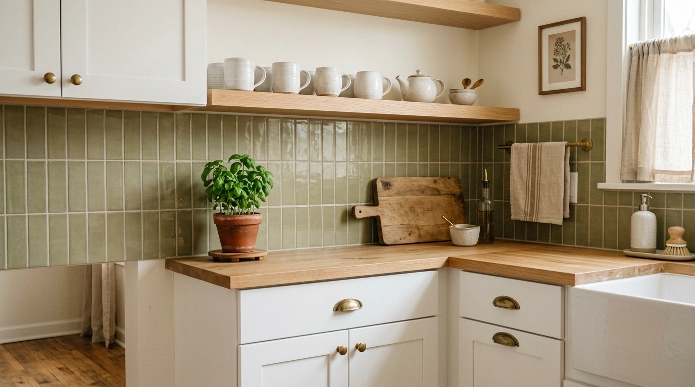
I suggest using a soft satin or semi-gloss finish to let the green tones play with the kitchen lighting. Lay them in a classic horizontal stack for a slightly modern twist, and use a warm off-white grout to keep the transition between the green tile and white cabinets soft. This color pairs beautifully with natural white oak open shelves and a few potted herbs on the counter.
Common Mistake to Avoid: Choosing a green that is too bright or primary, which can make the kitchen look like a fast-food restaurant.
Suggested Price Range: $7–$12 per square foot.
Vertically Stacked Soft Cream Tiles
If you have lower ceilings and want to make your kitchen feel taller and more spacious, stacking your tiles vertically is a brilliant trick. Using a soft, warm cream instead of a stark white softens the contrast against the white cabinets, making the kitchen feel incredibly inviting and gentle on the eyes. It is a subtle change in layout, but it gives the kitchen a modern, architectural feel without looking cold.
I always recommend starting with a $2 \times 8$ or $2 \times 10$ inch tile to get a long, slender vertical line. When installing, make sure your tiler uses a self-leveling system because vertical lines will show any slight crookedness very easily. This looks beautiful when styled with light wood tones, dried botanicals in ceramic vases, and warm, soft under-cabinet lighting.
Common Mistake to Avoid: Stacking tiles vertically with a highly contrasting grout, which can make your kitchen wall look like a barcode.
Suggested Price Range: $6–$10 per square foot.
Warm Terracotta Brick Veneer
For those who love a rustic, farmhouse vibe but want to keep their white cabinets looking fresh, a thin brick veneer backsplash is incredibly charming. The natural, earthy red and orange tones of terracotta bring an instant sense of history, warmth, and texture to the kitchen. It makes the space feel like a historic cottage where everyone naturally gathers to talk and eat.
Because real brick is highly porous and will absorb grease splatters, you must apply a high-quality matte penetrating sealer immediately after installation. To keep the look cohesive, use a wide, gritty gray mortar joint that looks like old-school masonry rather than modern tile grout. Balance the rustic brick by keeping your cabinet hardware simple and clean, such as oil-rubbed bronze pulls.
Common Mistake to Avoid: Skipping the sealer behind the stove, which will lead to dark, unremovable grease stains on the brick.
Suggested Price Range: $10–$18 per square foot.
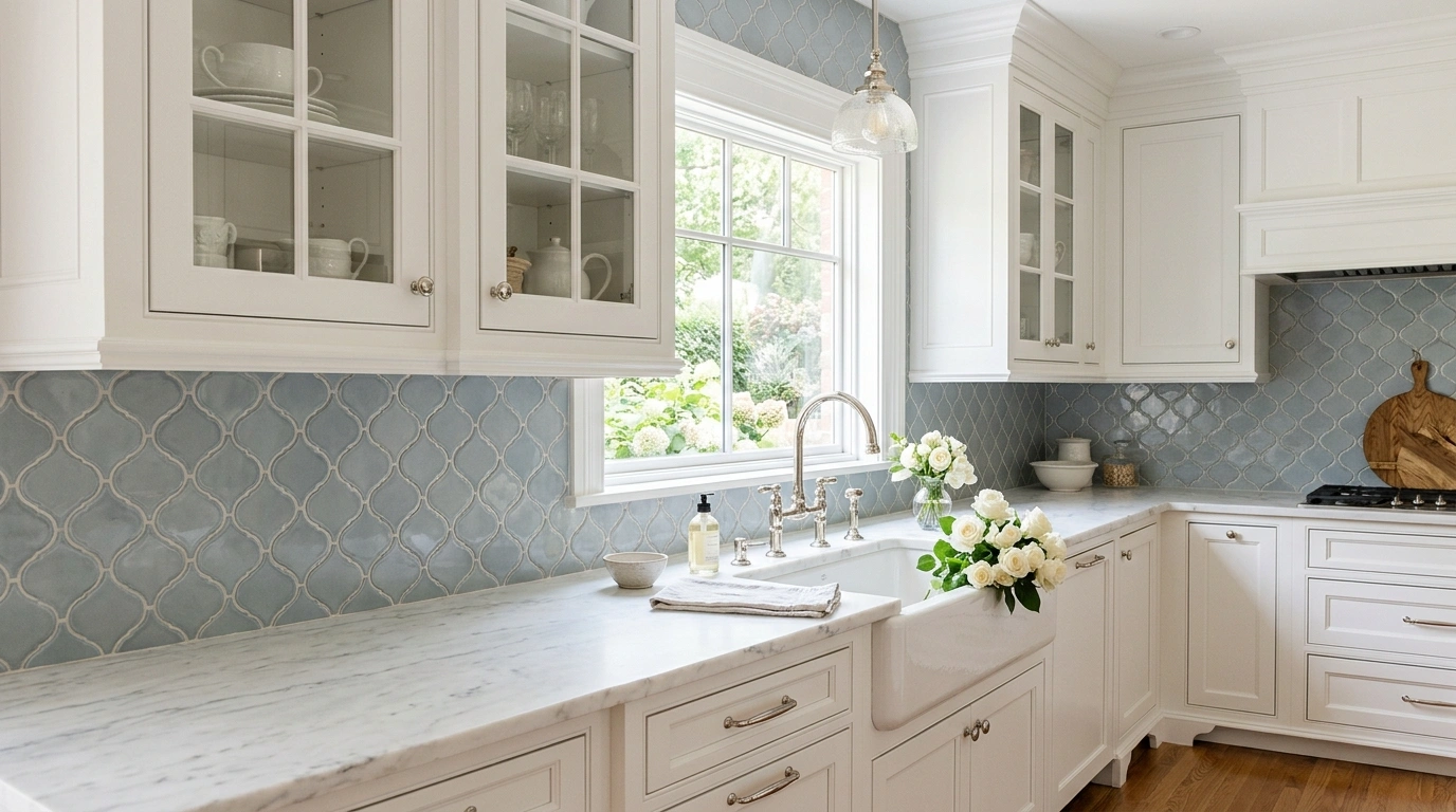
Soft Blue-Gray Arabesque Tile
If your style leans a bit more traditional and romantic, an arabesque pattern in a muted blue-gray is a gorgeous option. The curved, flowing lines of the tile break up the sharp, straight edges of your cabinet doors, adding a soft, graceful energy to the room. The color shifts beautifully from blue to gray depending on the time of day, keeping the kitchen feeling light, airy, and peaceful.
To keep this looking modern and not overly fussy, choose a tile with a solid, consistent glaze rather than a heavily distressed edge. Use a grout that matches the blue-gray shade perfectly so the focus stays on the elegant shape of the tiles rather than a busy grid pattern. This look coordinates beautifully with polished nickel hardware, which has a warm undertone that complements the cool blue-gray beautifully.
Common Mistake to Avoid: Using this busy pattern with highly speckled, busy granite countertops; it works best with simple quartz or marble.
Suggested Price Range: $12–$20 per square foot.
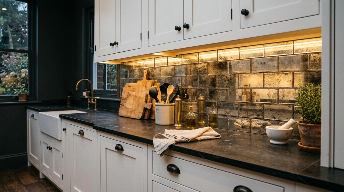
Antiqued Mirror Glass Subway Tiles
This is a fantastic option for small, dark kitchens that do not get a lot of natural light. The antiqued finish on the mirror glass softens the reflections, so you don’t feel like you are looking directly into a mirror while doing the dishes, but it still bounces light beautifully around the room. It gives the kitchen a warm, soft glow that feels incredibly moody, comforting, and unique.
Because glass tiles reflect so much, I always suggest using a very neutral, non-reflective gray grout. Make sure your under-cabinet light fixtures are warm and dimmable, as bright white LED strip lights can reflect off the glass and create a harsh glare. Style this with a few copper pots and warm wooden cutting boards to balance the cool, reflective glass.
Common Mistake to Avoid: Using standard, non-antiqued mirrors, which will look too cold and show every single fingerprint or water droplet.
Suggested Price Range: $18–$28 per square foot.
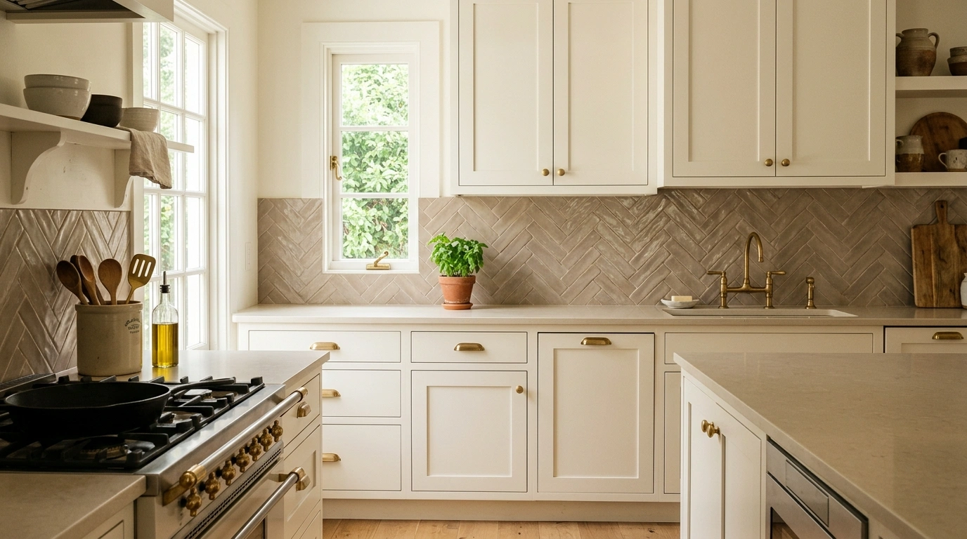
Textured Taupe Subway Tile in a Herringbone Pattern
Taupe is the ultimate chameleon color—it is a warm blend of gray and brown that brings a subtle, earthy sophistication to white cabinets. By choosing a tile with a textured, slightly wavy surface and laying it in a herringbone pattern, you create a gorgeous play of shadow and light. It feels calm, balanced, and perfectly coordinated without calling too much attention to itself.
To highlight the texture of the tile, I suggest using a light cream grout that is just a shade lighter than the taupe tile. This softens the herringbone pattern, keeping it quiet and inviting rather than sharp and geometric. It looks beautiful when paired with unlacquered brass hardware, which will naturally tarnish over time and match the earthy, organic feel of the taupe.
Common Mistake to Avoid: Using a dark grout that makes the herringbone pattern look too loud and busy in a small kitchen.
Suggested Price Range: $8–$15 per square foot.
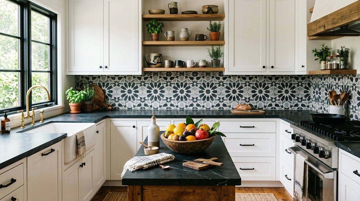
Moroccan Encaustic Cement Tile
If you want your kitchen to be the absolute center of conversation, cement tiles with a geometric Moroccan pattern are an incredible choice. The matte, velvety finish of cement has a beautiful weight to it, and the pattern adds character to the crisp white cabinets. It feels artistic, global, and highly creative, making it perfect for someone who loves to cook and entertain friends on the weekend.
Because cement tile is made from natural minerals, it is quite thick and heavy. Make sure your wall can support the weight and that your tiler is experienced with cement tiles, as they require sealing before grout is applied to prevent grout staining. Stick to a simple black, white, and gray color palette to keep the pattern feeling clean and modern rather than overwhelming.
Common Mistake to Avoid: Using a harsh chemical cleaner on cement tile, which can strip the sealer and fade the beautiful dyed patterns.
Suggested Price Range: $15–$25 per square foot.
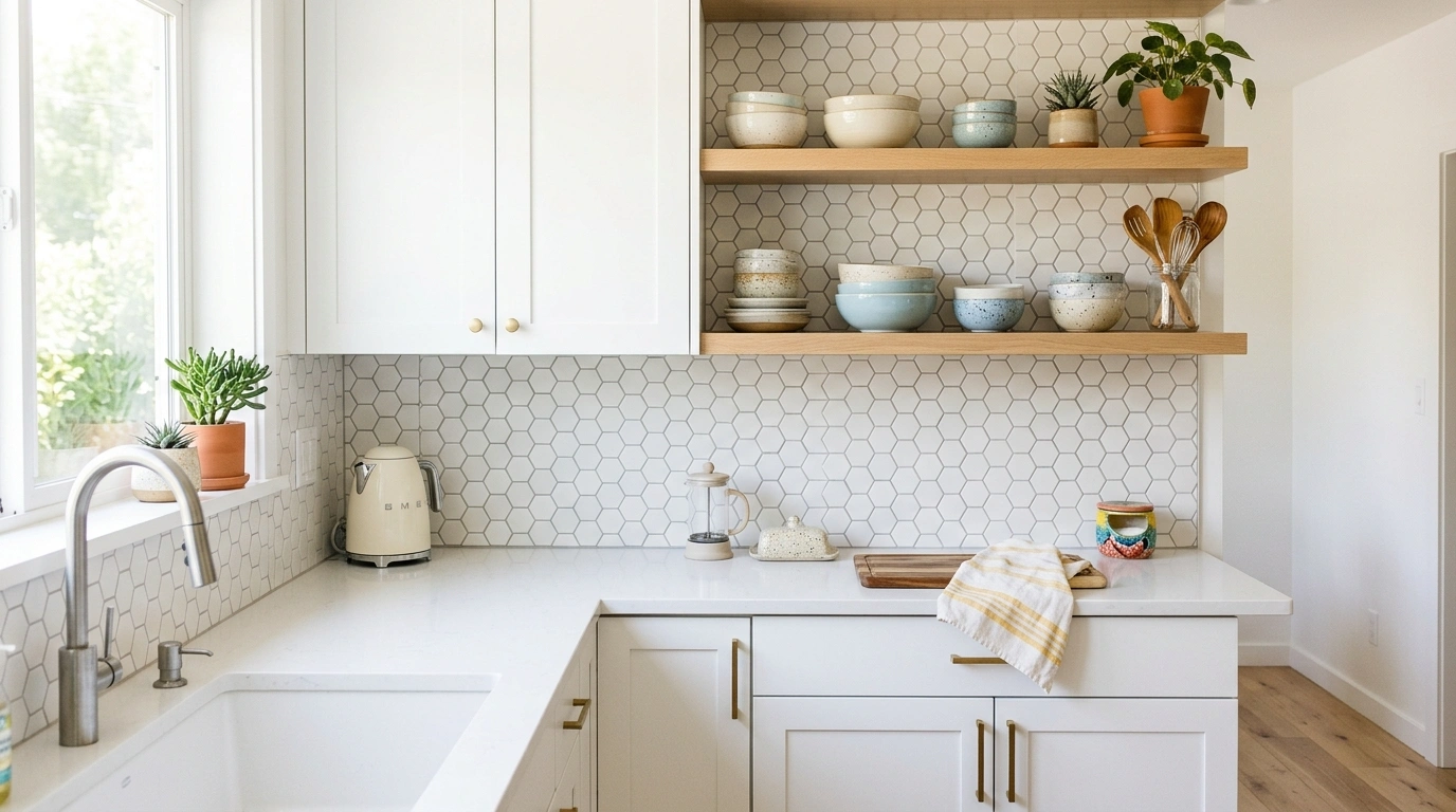
Matte White Hexagon Mosaic
For a clean, geometric look that feels a bit more playful than traditional subway tile, a small hexagon mosaic is a wonderful option. The matte finish gives the tile a soft, modern texture that feels smooth to the touch and looks beautiful under soft light. It is a fantastic, budget-friendly way to add interest to white cabinets while keeping the overall look bright and open.
To make the hexagonal shape stand out without looking chaotic, pair it with a soft, light gray grout. If your grout is too dark, the wall will look like a honeycomb; if it is too white, the pattern will completely disappear. Keep the kitchen feeling cozy by adding warm wooden elements, like a walnut knife block or oak floating shelves nearby.
Common Mistake to Avoid: Letting the tiler use standard white grout, which flattens the beautiful honeycomb pattern and makes it look like a plain sheet of drywall from a distance.
Suggested Price Range: $5–$9 per square foot.
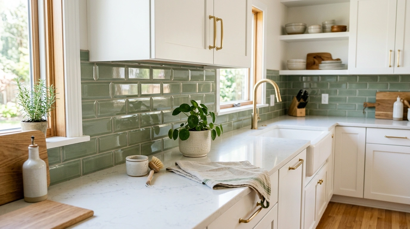
Sage Green Beveled Edge Subway Tile
Sage green is a soft, comforting color that pairs incredibly well with white cabinets because it brings a gentle, organic feel to the room. The beveled edges of the subway tile catch the light, adding depth and shadow to the wall, making the kitchen feel much more spacious. It is a lovely, cheerful look that feels like a quiet spring morning all year round.
I recommend laying these in a classic offset running bond pattern to keep the look traditional and familiar. Use a clean white grout to match your cabinets and tie the whole look together. This setup looks stunning when paired with brushed gold hardware and open shelves styled with white ceramic dishes and small green plants.
Common Mistake to Avoid: Choosing a glossy sage that is too light, as it can wash out and look almost white under bright under-cabinet lighting.
Suggested Price Range: $6–$12 per square foot.
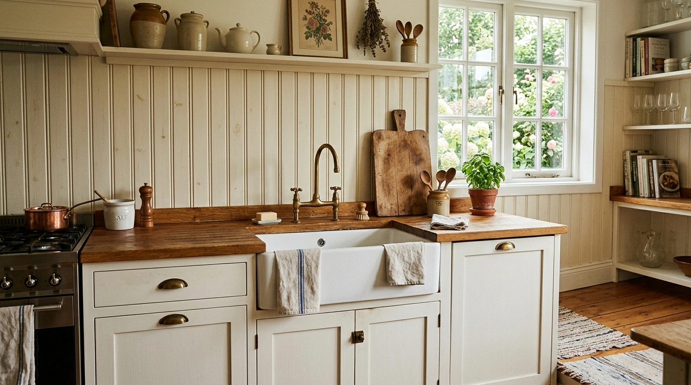
Classic Beadboard Panel Backsplash
If you are working with a tight budget or styling a cozy cottage-style home, a beadboard panel backsplash is a beautifully simple choice. The vertical grooves add clean, historic charm and height to the room without the cost or mess of traditional tiling. It feels incredibly warm, nostalgic, and relaxed, making your kitchen feel like a place where you can truly slow down.
To make this durable enough for a kitchen, you must use a high-quality, semi-gloss moisture-resistant paint that is easy to wipe down. I always recommend using a soft, warm off-white paint for the beadboard to create a very subtle contrast against your bright white cabinets. Pair this look with cup-style drawer pulls and a farmhouse sink for a truly classic look.
Common Mistake to Avoid: Using cheap MDF beadboard behind the sink; always use real wood or moisture-resistant PVC beadboard to prevent water damage and swelling.
Suggested Price Range: $2–$5 per square foot.
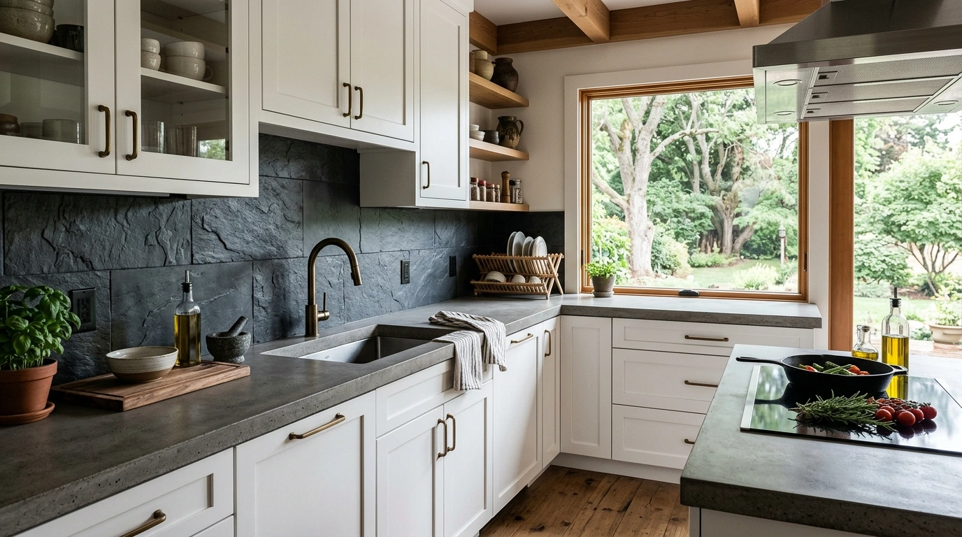
Charcoal Gray Slate Tile
For a kitchen that feels rugged, natural, and grounded, charcoal gray slate is a spectacular option. The natural cleft texture of slate brings an incredible organic feel to the kitchen, offering a beautiful contrast to the smooth, flat surfaces of white cabinets. It feels sturdy, comforting, and perfect for a home that loves hearty home-cooked meals and messy family baking projects.
Because slate is naturally dark, use a matching dark charcoal grout so the wall looks like a continuous, solid stone surface. Keep your countertops simple—like a light gray concrete or a clean white quartz—so the kitchen doesn’t feel too dark. Accent this look with warm leather cabinet tabs or raw wood accents to bring out the natural, cozy textures of the stone.
Common Mistake to Avoid: Buying slate tiles that are too thick or uneven, which can make mounting electrical outlet covers flush against the wall very difficult.
Suggested Price Range: $8–$14 per square foot.
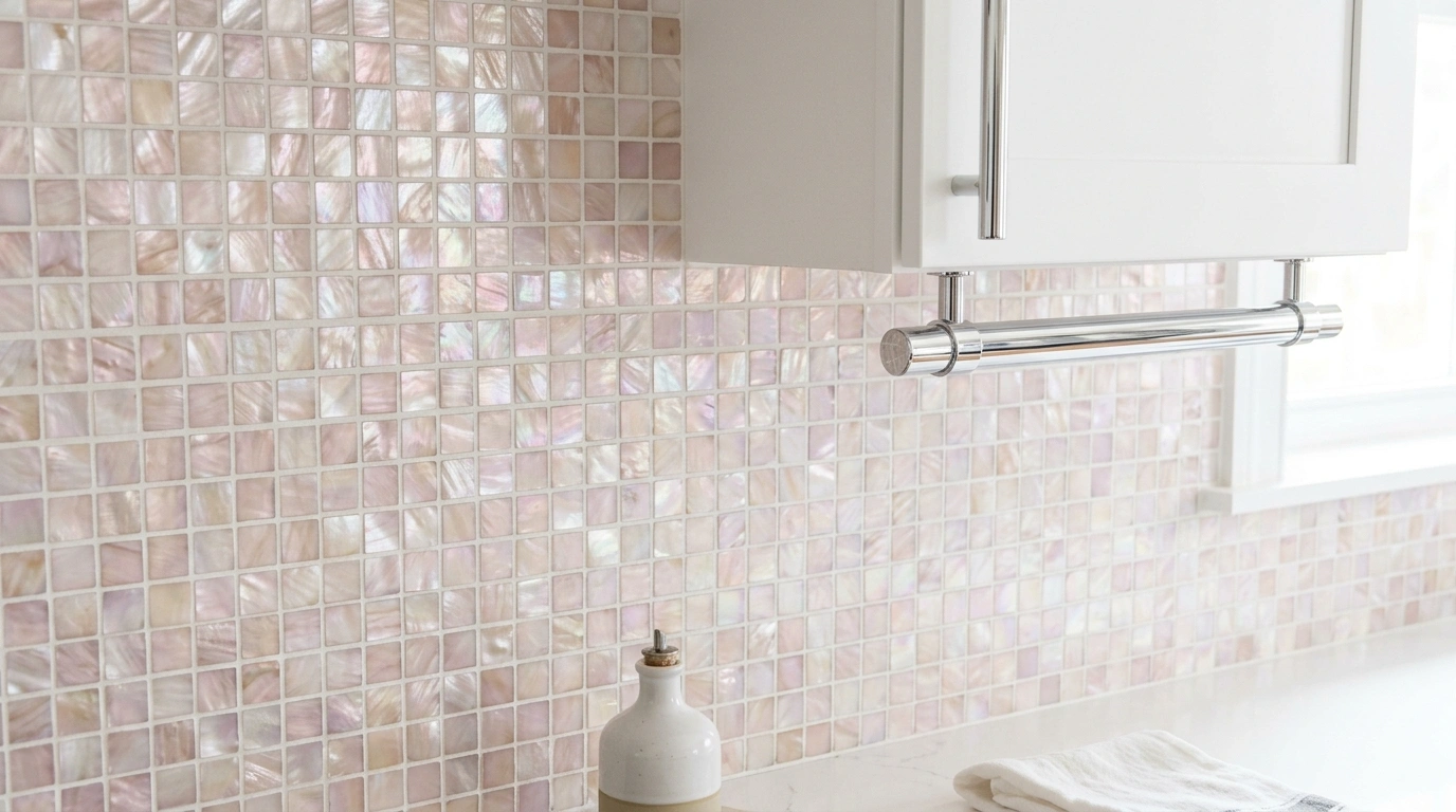
Mother of Pearl Mosaic Tiles
If you love a look that is soft, bright, and slightly iridescent, mother of pearl mosaic tiles are incredibly beautiful. The natural shells reflect a gorgeous range of soft pinks, blues, and creams when the light hits them, making your kitchen feel bright, open, and cheerful. It is a wonderful way to add a subtle shine and luxurious feel to the space without using harsh, glossy glass.
Because mother of pearl tiles are very thin, they require a smooth, flat wall surface for installation. I highly recommend using a non-sanded white grout to prevent scratching the delicate, polished surface of the shells. This backsplash looks best when paired with clean, modern white cabinets and simple, polished chrome hardware that mimics the bright, reflective quality of the tile.
Common Mistake to Avoid: Using sanded grout, which will permanently scratch and dull the natural shine of the shell tiles during installation.
Suggested Price Range: $20–$35 per square foot.
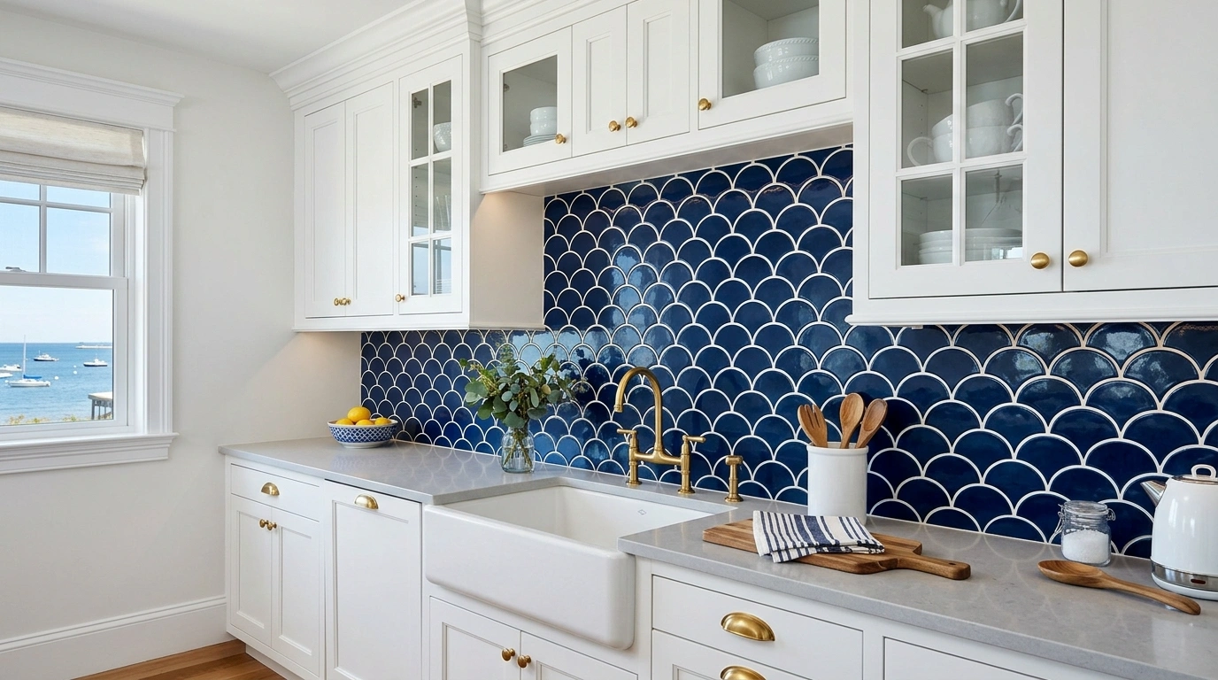
Navy Blue Glossy Fish Scale Tiles
If you want to bring a fun, coastal-inspired look to your kitchen, navy blue fish scale (or scallop) tiles are a stunning choice. The rich, deep blue color creates a bold, beautiful contrast against white cabinets, while the curved shape adds a playful, watery movement to the walls. It feels artistic, fresh, and incredibly inviting—like a sunny weekend cottage by the water.
To keep this looking clean and modern, use a crisp white grout that matches your cabinets, which will beautifully frame the unique shape of each tile. Since navy is a dark color, make sure your under-cabinet lighting is bright and evenly spaced to avoid dark corners. Pair this with polished brass hardware to create a warm, nautical-inspired color palette that looks incredibly intentional.
Common Mistake to Avoid: Laying the tiles upside down (points facing up) unless you want a very specific, modern art look; points facing down is the classic, most relaxing way to lay them.
Suggested Price Range: $14–$22 per square foot.
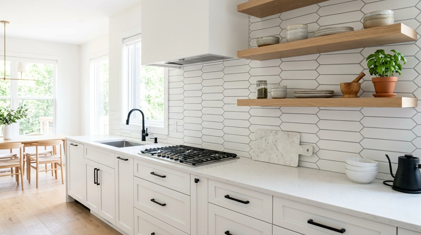
Matte White Picket Fence Tile
The picket fence tile is a beautiful, modern alternative to classic subway tile. It is a long, elegant hexagon that resembles a picket fence, giving your kitchen a clean, architectural look without feeling cold or clinical. By choosing a matte white finish, you keep the kitchen looking bright and open while adding a quiet, subtle pattern that feels incredibly fresh and modern.
I recommend installing these horizontally to make your kitchen feel wider and more expansive. Use a soft, warm gray grout to gently highlight the unique geometric shape of the tiles. This look pairs beautifully with warm white oak open shelving and minimalist matte black hardware for a balanced, modern look that feels incredibly welcoming.
Common Mistake to Avoid: Using a dark grout with this shape, which can make the lines look very busy and distract from the clean, geometric style.
Suggested Price Range: $7–$12 per square foot.
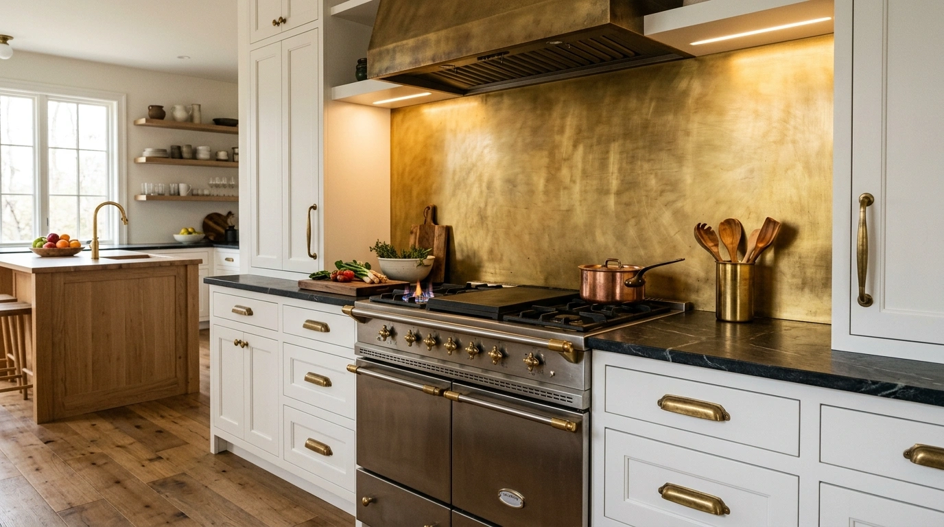
Brushed Brass Metal Sheet Backsplash
If you love a warm, metallic accent and want a look that is completely unique, a solid sheet of brushed brass is a gorgeous choice. It reflects a warm, golden glow across the kitchen, making the space feel incredibly cozy, luxurious, and bright. Over time, the brass will develop a beautiful, natural patina from cooking, giving your kitchen a lovely, living history that feels incredibly personal.
To keep this looking intentional and clean, have the brass sheet custom-cut to fit your wall exactly, with cutouts pre-made for your electrical outlets. You can clean it easily with a soft, damp cloth and mild soap—avoid harsh chemical cleaners that can strip the warm metal finish. This looks incredible when paired with matching brass cabinet hardware and dark soapstone or quartz countertops.
Common Mistake to Avoid: Using abrasive scrubbers to clean the metal, which will leave permanent scratches across the smooth surface.
Suggested Price Range: $35–$60 per square foot (custom cut and installed).
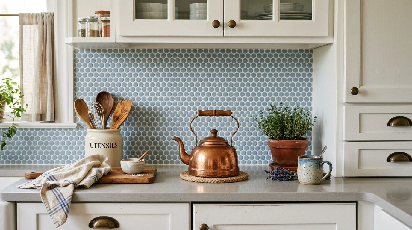
Penny Round Tiles in Matte Soft Blue
For a sweet, vintage-inspired look that feels incredibly friendly and charming, matte soft blue penny round tiles are a wonderful option. The small, round shapes add a soft, inviting texture to the wall that feels very different from square or rectangular tiles. The soft blue color is incredibly soothing, making the kitchen a calm, happy place to cook your favorite meals.
To make the round shapes pop beautifully, use a crisp white grout that matches your white cabinets. Because there are many grout lines with penny tiles, make sure to use a high-quality, stain-resistant grout sealer to keep the white lines looking bright and clean over time. This looks beautiful when styled with vintage copper copperware and fresh white flowers on the counter.
Common Mistake to Avoid: Skipping the grout sealer, which can lead to the small white grout lines turning yellow or gray over time from grease splatters.
Suggested Price Range: $6–$10 per square foot.
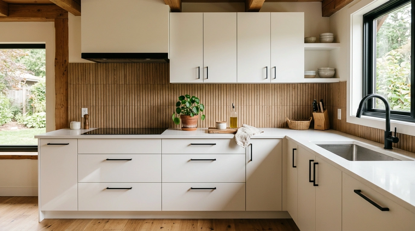
Fluted Wood-Look Ceramic Slats
This is a beautiful option if you want to bring the natural warmth of wood into your kitchen but need something durable and easy to clean behind your stove. These ceramic tiles are textured to look and feel like fluted oak slats, bringing a gorgeous vertical texture and organic warmth to your white cabinets. It feels calm, modern, and incredibly cozy—like a quiet cabin in the woods.
Use a matching warm brown grout to keep the vertical lines looking continuous and seamless. This texture looks best when paired with simple, clean white cabinets without a lot of busy molding or trim, allowing the beautiful wood texture to be the star of the show. Style this with black hardware and a few green plants to complete the natural, modern look.
Common Mistake to Avoid: Running the fluted lines horizontally; this tile is designed to run vertically to draw the eye up and create height.
Suggested Price Range: $12–$18 per square foot.
Conclusion
At the end of the day, designing your kitchen should be an exciting journey of expressing your personal style, rather than a source of stress. Your kitchen is the heart of your home—it is where morning coffees are shared, weekend meals are prepped, and memories are made. While white cabinets provide a clean, bright canvas, it is the backsplash that truly brings the space to life and makes it feel like home.
You do not need to spend a fortune on materials to create a space that looks polished and welcoming. Simple, budget-friendly choices like a classic subway tile with a warm gray grout or a textured vertical stack can look incredibly expensive when installed with care and attention to detail. I always recommend starting with just one or two tile samples—bring them into your kitchen, lean them against your wall under your cabinet lights, and watch how they change throughout the day before making your final choice.
Which of these kitchen backsplash for white cabinets ideas would you love to see in your own home? I’d genuinely love to hear about your design plans in the comments below!
Q: How do I make basic white kitchen cabinets look more expensive?
In my experience, the easiest way to make basic white cabinets look custom is to swap out generic hardware for high-quality brass or matte black pulls, and pair them with a textured tile backsplash like handcrafted Zellige. Adding warm, under-cabinet lighting also highlights the texture of your backsplash and gives the kitchen a cozy glow.
Q: What color grout should I use with white tile and white cabinets?
If you want a soft, classic look, I always recommend choosing a warm gray or soft cream grout rather than bright white or dark black. This outlines the shape of the tile gently without creating a harsh, high-contrast grid pattern that can feel overwhelming.
Q: How do I choose a backsplash that is easy to clean?
If easy cleanup is your top priority, choose a large-format tile or a continuous stone slab backsplash like marble or quartz, which has very few or no grout lines. If you love tile, glossy ceramic or glass surfaces are much easier to wipe down than matte or natural stone tiles.
Q: Can I install a new backsplash over an old one?
While you can technically tile over an existing backsplash if the surface is completely flat and stable, I always recommend removing the old tile first. This ensures your new tile adheres properly to the wall and does not stick out too far from your cabinets and countertops.
Q: What is the most budget-friendly backsplash option that still looks stylish?
A classic beadboard wood panel or standard white ceramic subway tiles are incredibly budget-friendly options that look beautifully polished. By choosing an interesting layout, like a vertical stack, or using a warm contrasting grout, you can make inexpensive materials look high-end.